| Author | Thread |
|
|
01/09/2009 01:14:41 AM |
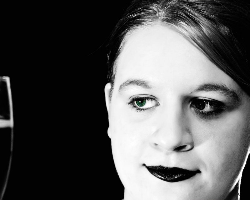
Good start. I like the high contrast B&W in this shot, but not sure about the one green eye. Maybe you could explain why you decided on only one eye. Is it a Twilight thing?
I think the crop is a little too tight as well as her chin is cut off and there's very little of the glass shown. |
|
 Photographer found comment helpful. Photographer found comment helpful. |
|
|
01/06/2009 10:05:17 AM |
| This has an almost creepy feel to it with the harsh contrasts and her ominous smile. Well done. |
|
| Photographer found comment helpful. |
|
|
01/03/2009 11:11:14 AM |
The high contrast approach really makes your daughter seem very mature. I agree with others comments about the cropping - the chin missing seems to throw off the image a bit. I do like the almost colored in look of the green eyes in this one - it seems to work for me here (and I am not usually a selective desaturation fan).
I am also not convinced by the object to the far left - it seems to be more distracting than enhancing to the photo |
|
| Photographer found comment helpful. |
|
|
01/02/2009 11:34:41 AM |
Composition: Portrait rule: Never ever ever crop the chin. Crop the forehead all you want, but not the chin. :) I agree with Dylan about the glass.
Lighting/Exposure: If you are using some other light source, I don't really see the need for the flash. I think this would have been oodles better had you just used your shop lights. I am not fond of what it did to her eye on the right.
Pose: Not really applicable as it is just a face shot :)
Suggestions for Improvements: Comp: pan out a bit and move the glass into the shot. I really think with the silhouette, it would have given it a little something extra. I would have liked to see her head turned a bit more to the left here. PP: I am still trying to work out why you chose to just make one eye green but the B&W conversion is nicely done. :)
I am a great fan of the Twilight books as well. Your daughter is very pretty! |
|
| Photographer found comment helpful. |
|
|
01/02/2009 08:49:16 AM |
| I like the idea a lot, and the contrast between white and black carries off the vampire idea well. The thing that keeps bugging me is the glass(?). I feel like it should either be there more prominently, or not at all. |
|
| Photographer found comment helpful. |
|
|
01/01/2009 11:05:29 PM |
interesting start! i like the high contrast feel, and the eye left saturated is a nice effect. however, i feel that the crop is a little too close, and one showing her entire face (or at least the rest of her chin) would open up the shot nicely.
glad to see you come aboard this challenge! |
|
| Photographer found comment helpful. |
Home -
Challenges -
Community -
League -
Photos -
Cameras -
Lenses -
Learn -
Help -
Terms of Use -
Privacy -
Top ^
DPChallenge, and website content and design, Copyright © 2001-2025 Challenging Technologies, LLC.
All digital photo copyrights belong to the photographers and may not be used without permission.
Current Server Time: 04/23/2025 04:20:22 AM EDT.