This is Kari Ann, greetings from the Critique Club:
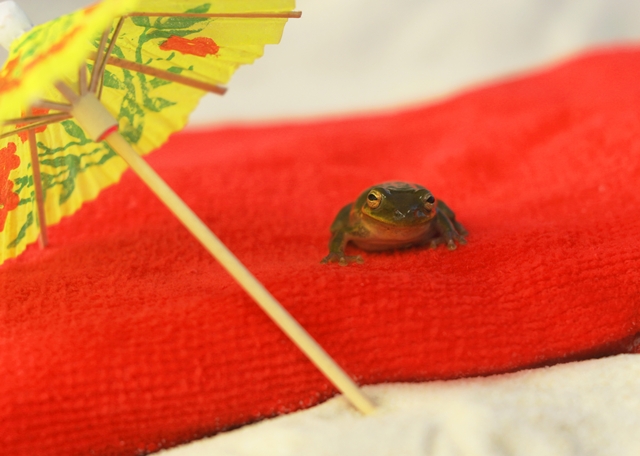
composition: the strong orange against the neutrals leads the eye to the frog, but he seems a bit out of place in the frame. Perhaps a different composition would have set him along a different line in the frame, making him more appealing.
color: reds are nice, yellows are vibrant, the greens are a little lost in the red though. but other then those minor nits, coloring is pleasing
contrast: pretty good, maybe more contrast between the red and sand to bring more interest.
focus: You got the focus dead on-great detail in those eyes
depth of field: I, along with another commenter, would have liked to see this with a smaller aperture used. i think the sand more in focus would have attracted nicer voters, and a higher score.
lighting: maybe toning down the brightness of the umbrella would have helped pull the eyes through the frame smoother. it kinda sticks out for me.
other: I find this photo humorous, it made me smile. I can also tell you had to put some time into catching that little critter. Kudos for that! The subject is something new and unusual, which is kinda risky with voters. They either love it or hate it. I feel they were a little harsh on you. Keep up the photography, don't let those voters get ya down! PM me if you have any other questions.
-Kari Ann |