| Author | Thread |
|
|
01/19/2009 05:23:04 PM |
| Just to clarify to other readers, I specifically asked Judi to critique this shot, and she seriously came through for me - thanks a million Judi! |
|
|
|
01/19/2009 04:08:47 PM |
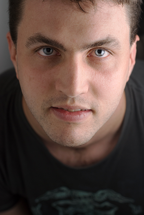
I am going to critique this image without reading your about as I don't want to be influenced by your type. When I first opened the image I saw a nice photo of a man but a little off balance. Upon looking at it more I can see the chin is pointing ever so slightly to his right...this does give a feeling of a lean to the image. That can help an image sometimes but when the image is such a close up and you can see his upper body it does make the viewer a bit giddy.
The details are good...the skin clean, the eyes clear. However...the mans right eye is slightly out of the focal range in comparison the the left eye...the way he is angling his face aids this problem. The lighting accentuates this problem also...if you had either gone full light or low light than this would have had so much more oomph. A cardboard covered in foil held on his right side to bounce back the light would have really helped or for low key you could have brought the light closer, made sure there was no other lighting on his right side and used a faster shutter speed to cut the amount of light entering the camera but in doing so only allowing light to hit one side of the face.
You may wonder why I suggest this? If you have a look at portraits online...most of them say something...they show some emotion. Unfortunately while this is a good portrait technically, it doesn't say anything to me. There is no strong emotion in the face. The lips show a slight discomfort to posing for the camera which can sway voters. Try other angles and poses. When he is posing talk to him. Raz him up with cheeky jokes or tell him how angry he is, to pretend his nasty boss is standing in front of him...whatever...to get that spark in the eye and the emotion in his facial muscles. His head is leaning forward past his shoulders which is very in the face attitude, but his expression doesn't mirror this pose.
In summary -
Technicals - good but need improvement with lighting, angle and composition.
Emotion of the Portrait - needs to be much stronger.
Relevant to the Challenge - Yes, it was a Life Challenge...but his pose and expression doesn't tell me what he is feeling.
Play with your lighting and angles a lot more. Try getting him to sit at a 45 degree angle and just read his book while you play with the lighting and angles...when you have it right get him to turn his head towards you and work that spark in his eye.
You are on the right track...you just need to take that step outside the safety zone...be daring and you will get it. |
|
 Photographer found comment helpful. Photographer found comment helpful. |
|
|
01/19/2009 06:31:01 AM |
pete has the most amazing eyes lonni .. its a shame you didnt score better .. its such an intense portrait ..
and thanks for the suggestion in he 'downtime suffered' thread .. when i realised that i was the one they were talking about i had to just think 'wotever' and leave the outcome in the hands of fate coz there was nothing i could do .. so i was very grateful that they rolled it over ..
you just left a nice comment on greg  gregoryB's yellow ribbon .. he is my insignificant other .. lol .. he's writing you a pm right this minute .. he thinks you look very like someone he knows and share the same surname .. :) gregoryB's yellow ribbon .. he is my insignificant other .. lol .. he's writing you a pm right this minute .. he thinks you look very like someone he knows and share the same surname .. :) |
|
| Photographer found comment helpful. |
Comments Made During the Challenge  |
|
|
01/18/2009 09:34:36 AM |
|
| Photographer found comment helpful. |
|
|
01/15/2009 08:50:10 PM |
|
| Photographer found comment helpful. |
|
|
01/13/2009 11:34:13 PM |
| His expression is not compelling, but the technique is great!!! |
|
| Photographer found comment helpful. |
|
|
01/13/2009 04:58:24 PM |
| A nice portrait, I think I would have liked to have seen him smile though. The brightness would have been better toned down and a bit more contrast. He has a lovely colour of eyes. |
|
| Photographer found comment helpful. |
|
|
01/13/2009 01:47:57 PM |
| good focus on eyes and mouth. |
|
| Photographer found comment helpful. |
|
|
01/13/2009 08:09:48 AM |
| Nice portrait; light looks very soft and natural. I might have cropped tighter on the bottom to get rid of the shirt design and more importantly get his eyes close to (or on) a rule of thirds line. The image feels more powerful to me cropped that way. |
|
| Photographer found comment helpful. |
|
|
01/12/2009 12:06:02 AM |
|
| Photographer found comment helpful. |
Home -
Challenges -
Community -
League -
Photos -
Cameras -
Lenses -
Learn -
Help -
Terms of Use -
Privacy -
Top ^
DPChallenge, and website content and design, Copyright © 2001-2025 Challenging Technologies, LLC.
All digital photo copyrights belong to the photographers and may not be used without permission.
Current Server Time: 03/10/2025 06:19:36 PM EDT.