| Author | Thread |
|
|
12/13/2011 09:25:24 AM |
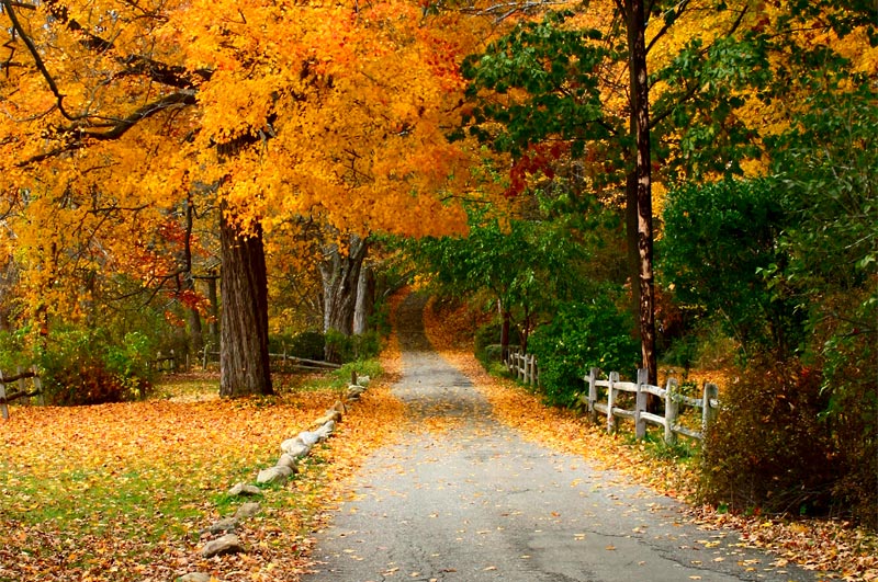
| This would make a very nice post card. On my screen, the dark green in the left side seems a little too dark. It is a perfect scene for a fall landscape. Thanks for sharing. I cans see why you would print it for your home collection. |
|
 Photographer found comment helpful. Photographer found comment helpful. |
|
|
11/18/2010 10:58:46 PM |
|
| Photographer found comment helpful. |
|
|
01/18/2009 02:02:22 AM |
| Lovely work with the edit - I'd not have considered the horizontal crop at first - creates a different scene and really brings out the gorgeous fall colors. |
|
| Photographer found comment helpful. |
|
|
01/16/2009 09:45:20 AM |
| Excellent editing! This is really pretty. Colors are gorgeous! |
|
| Photographer found comment helpful. |
|
|
01/14/2009 02:14:17 PM |
| Wow what a massive change! Love this edit :) |
|
| Photographer found comment helpful. |
|
|
01/13/2009 04:21:18 PM |
brilliant shot and process .. the colours are so vibrant and lovely and that path going off into the distance is excellent .. fantastic how you've cropped it compared to the original .. :)
Message edited by author 2009-01-13 16:22:21. |
|
| Photographer found comment helpful. |
|
|
01/12/2009 11:41:19 AM |
| This crop is just great! And you did a great job of taking out those white signs by the fence :-) I really like the in-your-face color; when I think back on scenes like this that I've witnessed, the colors are that bright in my imagination. Beautifully done! |
|
| Photographer found comment helpful. |
|
|
01/11/2009 06:15:43 PM |
| I think this is a big improvement on the original. I dont think there is too much contrast, and I really like how the lines draw you toward the centre. |
|
| Photographer found comment helpful. |
|
|
01/11/2009 11:53:25 AM |
| I think cropping the washed-out sky helps, though the verticality of the original helps draw one into the photo; however, the contrast between the trees and the path/fence/rock line-up work well enough to do the same. I definitely prefer the increased saturation in the new version -- nice rich color but not overdone. |
|
| Photographer found comment helpful. |
|
|
01/11/2009 08:24:48 AM |
| Really nice work Paul - I would love to take a walk here... |
|
| Photographer found comment helpful. |
|
|
01/11/2009 07:03:59 AM |
| Nice job of editing this. Truly magnificent autumn colours. |
|
| Photographer found comment helpful. |
|
|
01/10/2009 11:55:19 PM |
| Another great transformation for this challenge! You did a great job of editing and bringing out the leading line. I do like the saturation, but wonder if it's a bit overpowering. Contrast looks very good to me. |
|
| Photographer found comment helpful. |
|
|
01/10/2009 06:06:33 PM |
Wow! What a difference. I love this shot now, it has so much more pizzazz than the original.
Message edited by author 2009-01-10 18:15:38. |
|
| Photographer found comment helpful. |
|
|
01/10/2009 09:42:28 AM |
| Love the overall feel of what you did with it. The crop is excellent, the saturation lends the fall feeling. You might have overshapened just a tad though. |
|
| Photographer found comment helpful. |
Home -
Challenges -
Community -
League -
Photos -
Cameras -
Lenses -
Learn -
Help -
Terms of Use -
Privacy -
Top ^
DPChallenge, and website content and design, Copyright © 2001-2025 Challenging Technologies, LLC.
All digital photo copyrights belong to the photographers and may not be used without permission.
Current Server Time: 03/16/2025 01:47:29 AM EDT.