| Author | Thread |
|
|
05/20/2004 03:12:41 PM |
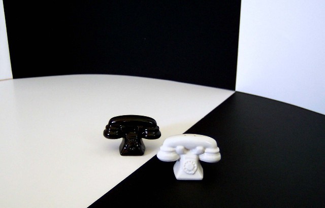
| Great shot, I agree totally with the crop on the left and moving the white phone to equal distance as the black one. |
|
 Photographer found comment helpful. Photographer found comment helpful. |
Comments Made During the Challenge  |
|
|
05/18/2004 02:17:34 PM |
| A good idea, you did need to crop the left edge to remove the left edge of the black area. |
|
| Photographer found comment helpful. |
|
|
05/15/2004 10:31:36 AM |
| Simple, effective and nice to look at. There are some things I think could improve your image: 1) The triangle of white on the top left edge is not needed, 2) Try moving the white phone just a bit to the right so that you can see the entire line of the boundary of the white/black, and 3) The whites should proably match better - remove the yellowish cast to the area under the black phone. But that's not saying it's not a great submssion as it is! Very well done! |
|
| Photographer found comment helpful. |
|
|
05/15/2004 09:43:04 AM |
| Wow! Tackiest shakers ever! Good idea, well composed. More directional lighting would have been nice on the shakers. |
|
| Photographer found comment helpful. |
|
|
05/14/2004 10:34:31 PM |
| Very nice on the challenge. I think it would be more effective if the shakers were closer to the intersection of the colors and then crop in closer. Good Effort. 8 |
|
| Photographer found comment helpful. |
|
|
05/14/2004 11:51:43 AM |
| Nice take on the challenge..no argument about whether this meets the challenge or not. |
|
| Photographer found comment helpful. |
|
|
05/13/2004 10:39:49 AM |
S & P aren't opposites.
The black and white is.
I like that.
|
|
| Photographer found comment helpful. |
|
|
05/12/2004 10:56:14 PM |
| Unique shakers. I might have cropped the left to rid the small wall white. |
|
| Photographer found comment helpful. |
|
|
05/12/2004 02:07:10 PM |
| Wow very interesting photo! The only thing I see is moving the little white phone to the right just a hair so it's not touching the white the other phone is sitting on. Otherwise, it's very pleasing to look at. I love b&w images like this and you have done a great job with this one. |
|
| Photographer found comment helpful. |
|
|
05/12/2004 12:56:39 PM |
| Not enough depth of field. The shot has clean lines between the black and white, the out of focus sections just blur this. More light, smaller apperture is needed. |
|
| Photographer found comment helpful. |
|
|
05/12/2004 11:14:34 AM |
... i just called to say .... i love it ! ..... the phones are just a bit blurry .
7 |
|
| Photographer found comment helpful. |
|
|
05/12/2004 07:11:25 AM |
|
| Photographer found comment helpful. |
|
|
05/12/2004 03:28:29 AM |
| too close to the center. Looks like the phones are outof focus too. |
|
| Photographer found comment helpful. |
Home -
Challenges -
Community -
League -
Photos -
Cameras -
Lenses -
Learn -
Help -
Terms of Use -
Privacy -
Top ^
DPChallenge, and website content and design, Copyright © 2001-2025 Challenging Technologies, LLC.
All digital photo copyrights belong to the photographers and may not be used without permission.
Current Server Time: 03/12/2025 02:39:28 AM EDT.