| Author | Thread |
Comments Made During the Challenge  |
|
|
05/18/2004 05:02:25 PM |
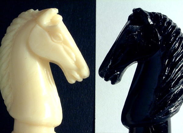
| Overall, I love this piece! My only criticisms, and I should mention that they are VERY minor ones, are that I would have prefered to see the same texture in the white background as I see in the black, and you may have been better served by shifting the image to a true B&W to eliviate the tonal differences between the "white" knight and the "white" background" -- I do find each of those just the slightest bit distracting. |
|
 Photographer found comment helpful. Photographer found comment helpful. |
|
|
05/16/2004 09:15:59 AM |
Good Idea. Detail on the black knight is missing
perhaps a little spot/frontal lighting on the black knight would have given more detail. |
|
| Photographer found comment helpful. |
|
|
05/15/2004 01:22:24 AM |
| A very nicely executed shot. The contrast and detail on the black horse is lost a little - setting the background further away might help to make the background disappear more. The black knight is cropped a little short on the right side. |
|
|
|
05/14/2004 04:35:08 PM |
| The black knight is underexposed. |
|
|
|
05/13/2004 06:50:55 PM |
| A good one for this subject. |
|
|
|
05/13/2004 04:04:32 AM |
| Very good idea.. Maby it would even be nicer if their nose would touch on the border and you could see the exact same of the knights(horses). 6 |
|
| Photographer found comment helpful. |
|
|
05/13/2004 12:41:44 AM |
| good idea, but the lighting is too sharp. a more uniform light would have been much better. |
|
|
|
05/13/2004 12:15:20 AM |
| should include the entire chess pieces... also should try to go for a background that matches the pieces |
|
|
|
05/12/2004 11:27:16 PM |
| very good idea, nice composition, but you're working with glossy figures, work with your lighting to get rid of glare spots. |
|
| Photographer found comment helpful. |
|
|
05/12/2004 09:09:36 PM |
| interesting juxtaposition! but instead of a bluish background it should have been white so you have white on black and black on white. |
|
|
|
05/12/2004 07:09:51 AM |
| Nice job, excellent idea but it doesn't have much bang! Good idea though keep working on it... |
|
|
|
05/12/2004 12:58:06 AM |
| Nice idea! I like this better than the other yin-yang ones I've seen so far. But I wish you had pulled off full symmetry here, and maybe true color symmetry as well. |
|
| Photographer found comment helpful. |
Home -
Challenges -
Community -
League -
Photos -
Cameras -
Lenses -
Learn -
Help -
Terms of Use -
Privacy -
Top ^
DPChallenge, and website content and design, Copyright © 2001-2025 Challenging Technologies, LLC.
All digital photo copyrights belong to the photographers and may not be used without permission.
Current Server Time: 03/15/2025 12:40:34 PM EDT.