| Author | Thread |
Comments Made During the Challenge  |
|
|
02/03/2009 07:38:54 PM |
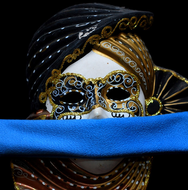
| I really like the mask in this pic. the details on it are nice. |
|
 Photographer found comment helpful. Photographer found comment helpful. |
|
|
02/02/2009 11:04:13 PM |
| nice looking mask, the lighting is a bit flat. |
|
| Photographer found comment helpful. |
|
|
02/01/2009 12:52:53 PM |
| Nice enough but I feel it's a little bit dull - I'd like the white to be a bit brighter and it bothers me slightly that it's not square, it's leaning down to the left. |
|
| Photographer found comment helpful. |
|
|
02/01/2009 10:18:18 AM |
| The shot is technically very well executed with great detail and lighting and I like the way the outline of the mask and headdress fades away into the dark background. What spoils it for me is the blue strip of blanket that is stretched across the mouth of the mask and the whole frame. I guess it's meant to imply that the mask is silenced or silent but it somehow does not get that message across very effectively for me and as I said it detracts from an otherwise very nice shot. Maybe you could have used have used something else instead of the blanket to create the effect you wanted. 7 |
|
| Photographer found comment helpful. |
|
|
01/30/2009 07:27:10 PM |
| Very interesting interpretation of silence. The texture/color of the blue cloth across the mouth clashes somewhat with the mask to my eyes. Otherwise, I love the execution. |
|
| Photographer found comment helpful. |
|
|
01/30/2009 06:51:56 PM |
|
| Photographer found comment helpful. |
|
|
01/30/2009 02:42:35 PM |
| Good idea but the fabric you used is not so good maybe silk whold have worked more with the shot. |
|
| Photographer found comment helpful. |
|
|
01/28/2009 11:44:53 AM |
| Your image would have been improved by a different choice of fabric such as silk to better match the feel of the mask. |
|
| Photographer found comment helpful. |
|
|
01/28/2009 11:42:51 AM |
| very very nice--but should be in a different challenge. the towel is there only to qualify it and actually distracts from a better exposure. |
|
| Photographer found comment helpful. |
|
|
01/28/2009 12:19:39 AM |
It seems so blurry.
And I just think that this photo could of been much more creative. |
|
Home -
Challenges -
Community -
League -
Photos -
Cameras -
Lenses -
Learn -
Help -
Terms of Use -
Privacy -
Top ^
DPChallenge, and website content and design, Copyright © 2001-2025 Challenging Technologies, LLC.
All digital photo copyrights belong to the photographers and may not be used without permission.
Current Server Time: 03/10/2025 07:06:44 PM EDT.