| Author | Thread |
Comments Made During the Challenge  |
|
|
05/18/2004 11:55:41 PM |
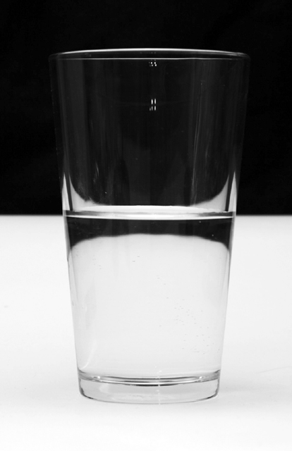
| I like the way you linedup the seperation of B&W with the level of liquid in the glass. It works. |
|
|
|
05/18/2004 01:48:54 PM |
| great shot. best of this theme, (IMHO). i don't know whether the droplet adds to the image...i find it distracting from the otherwise clean lines... |
|
|
|
05/17/2004 06:25:11 PM |
| Half empty or half full is the same |
|
|
|
05/17/2004 05:06:58 PM |
| love this! only other comment or wish might be that the points of light in the center top of the glass look out of place/distracting |
|
|
|
05/17/2004 11:31:29 AM |
| which one is true? Is it full or empty? |
|
|
|
05/15/2004 01:44:56 PM |
| i like it, but it could have been focused better. |
|
|
|
05/15/2004 02:34:23 AM |
| good pic - best use of theme so far. only concern is the flash seen in the top of the glass - obviously un avoidable. well done |
|
|
|
05/14/2004 09:35:41 AM |
pos
1. Good idea
2. Fits the challenge
3. just a beautiful shot
neg
1. Focus , focus focus!!!!
2. The glare in the glass (on top by the middle) is disturbing
Overall i like this shot, It´s original
Just could be a lot better
|
|
|
|
05/13/2004 11:00:26 PM |
| very interesting...would do better without the dribble on the top half... |
|
|
|
05/13/2004 04:58:13 PM |
| Nicely done. Mabye a little soft at the bottom? Good entry. |
|
|
|
05/13/2004 03:20:28 PM |
| a very creative photo and neat concept, nicely executed! |
|
|
|
05/13/2004 12:58:17 PM |
| This is one of my favorites for the week, I hope it places high. Good job! |
|
|
|
05/13/2004 11:14:19 AM |
| Nice, simple picture, well illustrated. |
|
|
|
05/13/2004 01:26:49 AM |
|
|
|
05/12/2004 11:30:17 PM |
| nice composition but blurry |
|
|
|
05/12/2004 09:39:56 PM |
| Wonderfull idea and the use of lighting is great! |
|
|
|
05/12/2004 04:33:52 PM |
| Great image - beautifully balanced and well composed (10) |
|
|
|
05/12/2004 02:24:14 PM |
| best of the optimist-pessimist ideas |
|
|
|
05/12/2004 01:19:30 PM |
| One of the better 'galss of water' entries, but still feels uninspiring. With so many people using the same metaphor an image has to sparkle to stand out from the croud. This doesn't sparkle I'm afraid. |
|
|
|
05/12/2004 09:18:28 AM |
|
|
|
05/12/2004 02:59:44 AM |
the classic conundrum .... always loved black and white things ... loved the way the middle was split ... you could have gotten rid of the window reflection near the top ... otherwise a very finely executed photograph.
9 |
|
|
|
05/12/2004 01:25:24 AM |
| I really like the way the light shows up the rim of the glass. The slight reflection in the upper center of the glass is distracting. Nicely done. |
|
|
|
05/12/2004 12:17:29 AM |
|
Home -
Challenges -
Community -
League -
Photos -
Cameras -
Lenses -
Learn -
Help -
Terms of Use -
Privacy -
Top ^
DPChallenge, and website content and design, Copyright © 2001-2025 Challenging Technologies, LLC.
All digital photo copyrights belong to the photographers and may not be used without permission.
Current Server Time: 03/12/2025 07:42:41 AM EDT.