| Author | Thread |
|
|
02/14/2009 11:43:36 PM |
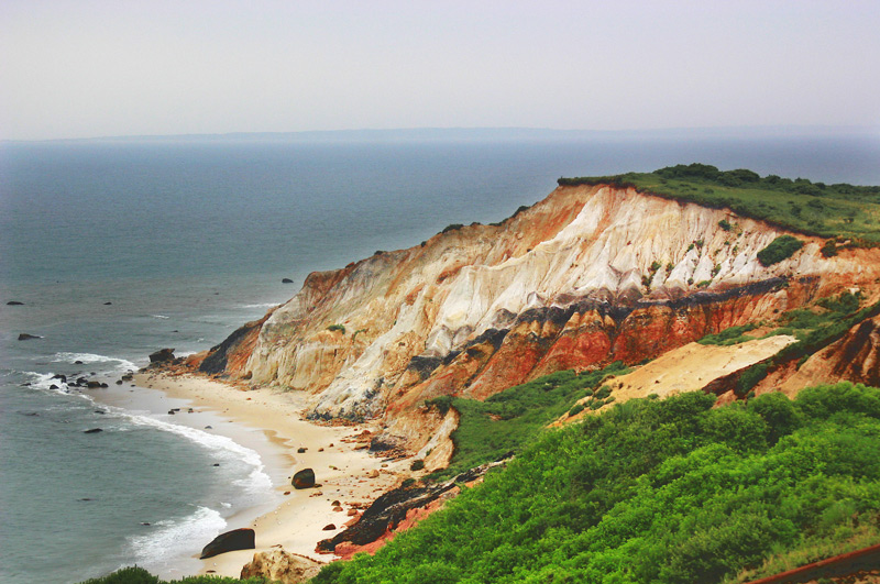
| I think the saturation is fine, although the lower right tends to draw the eye a bit. If you boosted the blue in the water (as suggested by others) it would balance things out a bit. This must have been amazing to see in real life, your photo makes me want to go there and shoot and shoot and shoot. |
|
 Photographer found comment helpful. Photographer found comment helpful. |
|
|
02/06/2009 03:16:36 PM |
| Not oversaturated at all. I agree with the General, I'd add some more blue to the water. |
|
| Photographer found comment helpful. |
|
|
02/05/2009 06:27:13 PM |
| You have made a great improvement....love the colour of the cliffs |
|
| Photographer found comment helpful. |
|
|
02/04/2009 11:33:52 PM |
I don't think it's oversaturated, in fact, I'd be tempted to mask off the sea and sky and make them even a little more blue.
You definitely brought out the detail, and gave a different "feel" to the day. |
|
| Photographer found comment helpful. |
|
|
02/03/2009 05:36:49 PM |
| I especially love the warm colours you have brought out in the cliffs. This image certainly has more impact than the original. |
|
| Photographer found comment helpful. |
|
|
02/03/2009 12:16:12 AM |
| Yeah, a little over the top in that the muted water tones don't match the light and brights in the rocks and foliage. I'd crop some of that sky out to bring the attention more down to your cliffs. |
|
| Photographer found comment helpful. |
|
|
02/01/2009 02:16:22 PM |
| You've done a fabulous job of removing the haze present in the original. I really love the intensity of the colors and the defined texture in rocks, you definitely met your stated goal! |
|
| Photographer found comment helpful. |
|
|
02/01/2009 12:23:27 PM |
| Lovely work bringing out the color and contrast in this! I love being able to see the formations in the outcropping. |
|
| Photographer found comment helpful. |
Home -
Challenges -
Community -
League -
Photos -
Cameras -
Lenses -
Learn -
Help -
Terms of Use -
Privacy -
Top ^
DPChallenge, and website content and design, Copyright © 2001-2025 Challenging Technologies, LLC.
All digital photo copyrights belong to the photographers and may not be used without permission.
Current Server Time: 04/23/2025 06:52:53 AM EDT.