| Author | Thread |
|
|
02/08/2009 12:51:30 PM |
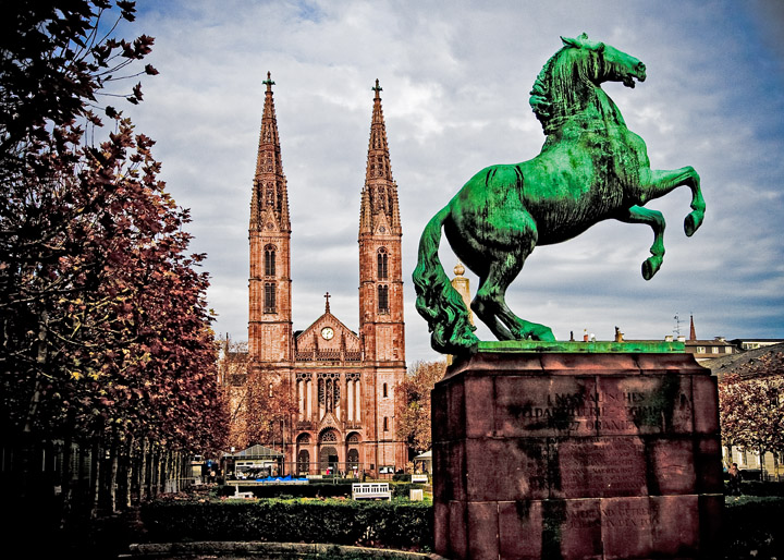
| I like the sharpening and the contrast added to the shot, and the texture with the draganizer like preset it good. The only thing I find out of place is the colour of the horse, its a bit too saturated IMO. |
|
 Photographer found comment helpful. Photographer found comment helpful. |
|
|
02/06/2009 10:21:27 PM |
| Wow! Very nice edit. What was once a flat image now has a contrast that adds a lot of depth to it. |
|
| Photographer found comment helpful. |
|
|
02/06/2009 06:19:19 PM |
| You have certainly brought a lot out if this. The brilliant green horse adds a touch of surrealism. |
|
| Photographer found comment helpful. |
|
|
02/06/2009 04:58:55 PM |
| Really neat processing. Love all the church details. I am not too hot about the bright green horse, though it does provide a very strong focal point. :) |
|
| Photographer found comment helpful. |
|
|
02/06/2009 04:29:18 PM |
|
| Photographer found comment helpful. |
|
|
02/06/2009 03:41:34 PM |
| Great edit Deb! Love the pumped up colors, and the crop really brings it in well. Lots of detail brought out on the church. |
|
| Photographer found comment helpful. |
Home -
Challenges -
Community -
League -
Photos -
Cameras -
Lenses -
Learn -
Help -
Terms of Use -
Privacy -
Top ^
DPChallenge, and website content and design, Copyright © 2001-2025 Challenging Technologies, LLC.
All digital photo copyrights belong to the photographers and may not be used without permission.
Current Server Time: 04/25/2025 05:17:55 AM EDT.