| Author | Thread |
Comments Made During the Challenge  |
|
|
02/22/2009 10:01:38 PM |
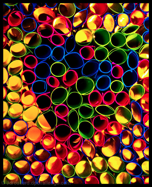
| Nice point of view. But I am not sure if I like the heart. It is a bit distracting... |
|
 Photographer found comment helpful. Photographer found comment helpful. |
|
|
02/22/2009 08:22:25 PM |
| Didn't see the heart until after reading the title. Kind of reminds me of those images they use to test for color blindness. |
|
| Photographer found comment helpful. |
|
|
02/22/2009 07:03:02 PM |
| Colors are very vivid, however, there is too much yellow making the photo difficult to look at for very long. |
|
| Photographer found comment helpful. |
|
|
02/22/2009 02:54:26 PM |
| Very cool! I love this idea. So so beautiful. |
|
| Photographer found comment helpful. |
|
|
02/21/2009 12:47:36 PM |
|
| Photographer found comment helpful. |
|
|
02/21/2009 02:31:46 AM |
| Nice idea and creative image. I don't know if I like the yellow bottom here. Colors are little too saturated. May be it would have looked better if it was backlit. |
|
| Photographer found comment helpful. |
|
|
02/20/2009 12:13:27 PM |
| just a bit to busy...hard to see what the design is at first...took me a little while to find it... |
|
| Photographer found comment helpful. |
|
|
02/19/2009 03:53:54 PM |
| Great idea but a bit too busy. The heart wasn't obvious enough. |
|
| Photographer found comment helpful. |
|
|
02/17/2009 11:14:30 AM |
|
| Photographer found comment helpful. |
|
|
02/16/2009 05:35:30 PM |
| Interesting abstract. Strong colors. A bit too busy and oversaturated for my taste. |
|
| Photographer found comment helpful. |
|
|
02/16/2009 04:01:17 AM |
|
| Photographer found comment helpful. |
Home -
Challenges -
Community -
League -
Photos -
Cameras -
Lenses -
Learn -
Help -
Terms of Use -
Privacy -
Top ^
DPChallenge, and website content and design, Copyright © 2001-2025 Challenging Technologies, LLC.
All digital photo copyrights belong to the photographers and may not be used without permission.
Current Server Time: 03/14/2025 10:34:57 PM EDT.