| Author | Thread |
|
|
06/12/2004 10:39:38 AM |
|
 Photographer found comment helpful. Photographer found comment helpful. |
Comments Made During the Challenge  |
|
|
05/19/2004 10:34:48 AM |
| The subject matter is too far away to make a strong visual statement. It's a rather boring shot. |
|
| Photographer found comment helpful. |
|
|
05/18/2004 12:53:20 PM |
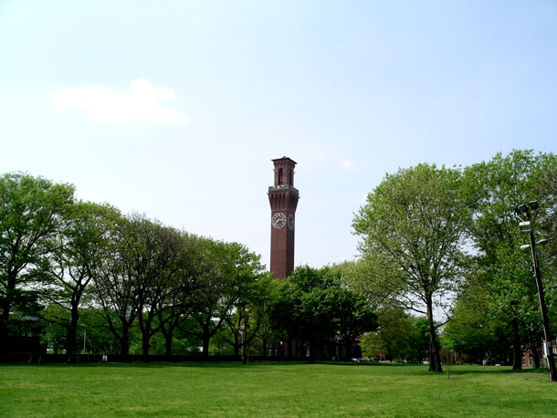
| Don't think this scene works as a centered shot. |
|
| Photographer found comment helpful. |
|
|
05/17/2004 05:00:12 PM |
| I'd have used the 'distort' or 'perspective' tools in PS to correct the leaning verticals on the right. Sky is a bit washed out... a little less exposure would have helped, you could have rescued the shadow detail using curves in PS. Shot is lacking a 'wow' factor for me. |
|
| Photographer found comment helpful. |
|
|
05/17/2004 04:45:29 PM |
| even though the clock tower is in the center of the composition it looks very odd there so far away from me, the spectator... It looks as if the parc and the trees are the main subjects of interest and then suddenly there is that tower! The effect is, mentioned already, odd and I don't realy like it..but on the other hand you score some points for making creative use of the centered composition by overruling all rules about it!! |
|
| Photographer found comment helpful. |
|
|
05/17/2004 12:45:48 AM |
| Good use of leading lines. Tower looks like it's leaning slightly. I think this would work better if it were more tightly cropped - the sky is fairly hazy and blah, so the less of it in the picture the better. And perhaps a polarizing filter to darken the sky as well. |
|
| Photographer found comment helpful. |
Home -
Challenges -
Community -
League -
Photos -
Cameras -
Lenses -
Learn -
Help -
Terms of Use -
Privacy -
Top ^
DPChallenge, and website content and design, Copyright © 2001-2025 Challenging Technologies, LLC.
All digital photo copyrights belong to the photographers and may not be used without permission.
Current Server Time: 03/10/2025 09:38:22 PM EDT.