| Author | Thread |
|
|
05/30/2004 09:29:03 AM |
Greetings from the Critique Club!
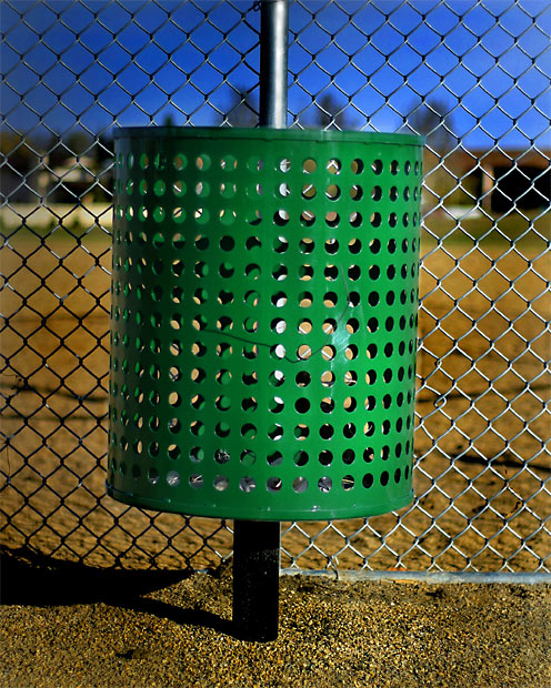
Honestly, I find this picture very difficult to critique. It has a lot of good things going for it. Perhaps it's greatest asset, as many of your commenters said, is it's very strong, vibrant colors. It is also strong technically; good DOF, good exposure. I can't tell if I like the composition or not. Yes, the circles compete with the diamonds of the fence, but they are similar in repetition and so work together. Yes, the top of the pole is centered in the frame, and the horizon is straight, but somehow the can itself feels left of center and tilted. There's also something in the bottom of the can teasing me. I either wish I could see it, or wish it wasn't there.
But the defining difficulty about this photograph for me it is the subject matter. I always like looking at your pictures in challenges because they have a simple, crisp beauty, and I was not surprised to find out this was your picture. When I was voting, my first response was, "Well, THAT's something new!", and then.... ambivalence. In short, I feel like I should like it more than I do. But that's just one girl's opinion.
I hope this helps! Feel free to email me if you have any questions or comments,
Amanda |
|
Comments Made During the Challenge  |
|
|
05/22/2004 09:57:16 PM |
| What I like about this image is the STRONG distinct colors (brown, blue, and green). Other then that however it's not very interesting, and it's tilted to the right. |
|
 Photographer found comment helpful. Photographer found comment helpful. |
|
|
05/22/2004 07:43:03 PM |
| A comon subject, but the strong colors make this image work for me visually. The dark blue of the sky really helps here. I also like the texture of the sand on the ground. 8 |
|
| Photographer found comment helpful. |
|
|
05/21/2004 03:20:13 PM |
|
| Photographer found comment helpful. |
|
|
05/19/2004 08:36:42 AM |
| Yes, it's centered, yes it has bright colours that draw your attention, however the subject is uninteresting and the circles on the garbage can compete with the squares in the fence from a visual design standpoint. Circles and squares can work if one is the main subject and the presence of the other is subtle. Unfortunately, both are very prominent in your image. 4 |
|
| Photographer found comment helpful. |
|
|
05/18/2004 10:12:34 PM |
| Nice color. I may have cloned out the little hot spot on the green garbage can. Did I say that I liked the color? Very Nice. |
|
| Photographer found comment helpful. |
|
|
05/18/2004 05:39:57 PM |
| I like this. Subject centered, excellent colors...especially the way the blue plays into the green and the green into the ground/background colors. Excellent dof that makes the Ball holder (I think) really stand. Subject matter a little different for me but still high marks. |
|
| Photographer found comment helpful. |
|
|
05/17/2004 09:09:49 PM |
| i realy like the colors of this shot, they're very vivid. |
|
| Photographer found comment helpful. |
|
|
05/17/2004 02:49:01 PM |
| Technically excellent, very vicbrant colour. |
|
| Photographer found comment helpful. |
|
|
05/17/2004 01:13:12 PM |
Challenge centered –10
Creative –6
Appeal (is it interesting?) –6
Technical -10
|
|
| Photographer found comment helpful. |
|
|
05/17/2004 12:46:36 PM |
| Ah, untitled when it should have been "Litteraly Centered". Nice colors in this one! |
|
| Photographer found comment helpful. |
Home -
Challenges -
Community -
League -
Photos -
Cameras -
Lenses -
Learn -
Help -
Terms of Use -
Privacy -
Top ^
DPChallenge, and website content and design, Copyright © 2001-2025 Challenging Technologies, LLC.
All digital photo copyrights belong to the photographers and may not be used without permission.
Current Server Time: 03/12/2025 05:39:18 PM EDT.