| Author | Thread |
Comments Made During the Challenge  |
|
|
05/25/2004 06:14:33 PM |
| Nice shot, very creative. |
|
 Photographer found comment helpful. Photographer found comment helpful. |
|
|
05/24/2004 10:29:10 AM |
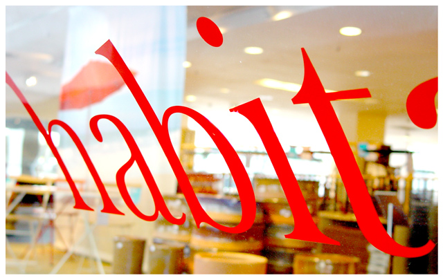
| nice back ground blur great sharpness on the words .. you got a little glare on the glass over part of the word that is a little distracting . but over all a good shot |
|
| Photographer found comment helpful. |
|
|
05/22/2004 01:42:18 AM |
| There isn't enough visual appeal to the sign on the window for it to be the main focus. Cropping the edge of what I assume is the letter "a" for habitat would have made this a little more effective. |
|
|
|
05/21/2004 11:40:21 AM |
| absolutely brilliant. My favourite of the comp.......just wish I'd thought of this...damn you.! ;-) If I were the sole judge this would win...congratulations on the Tallbloke ribbon. 10 |
|
| Photographer found comment helpful. |
|
|
05/20/2004 06:08:11 PM |
| Stunning. The colors are rich and compelling, the angle of the type on the glass is wonderfully compelling and the DOF gives it an extra kickk. |
|
| Photographer found comment helpful. |
|
|
05/20/2004 04:15:50 PM |
| Novel take and well focused. |
|
| Photographer found comment helpful. |
|
|
05/19/2004 11:19:35 PM |
| I give you credit for creativity but this looks like it has been PSed. Let me know if I'm wrong, I still like it. |
|
| Photographer found comment helpful. |
|
|
05/19/2004 09:36:28 PM |
| Like the position of the letters and the reflection... far the most "reliated to theme shot" i've seen in challenges!! |
|
| Photographer found comment helpful. |
|
|
05/19/2004 04:49:33 PM |
|
| Photographer found comment helpful. |
|
|
05/19/2004 04:33:58 PM |
|
|
|
05/19/2004 03:34:16 PM |
| i like this, but the 'h' shouldnt be cut off and whatever the letter on the right shouldnt be either |
|
|
|
05/19/2004 02:57:26 PM |
|
| Photographer found comment helpful. |
|
|
05/19/2004 02:43:59 PM |
| I would've liked to have seen the right edge cropped out. Still would've recognized the 't', but without the distraction of the next letter. |
|
|
|
05/19/2004 12:32:00 PM |
| Someone once told me that Words are a crutch. |
|
|
|
05/19/2004 11:38:49 AM |
| Really nice photo, I love the composition and the fact that there is no glare coming from the window. Well done. |
|
| Photographer found comment helpful. |
|
|
05/19/2004 11:23:56 AM |
|
| Photographer found comment helpful. |
|
|
05/19/2004 08:56:11 AM |
| Now this is much more interesting and creative than I would have expected from this site. The background lighting is a little hot but it's not really a point of distraction. |
|
| Photographer found comment helpful. |
|
|
05/19/2004 07:16:02 AM |
| I wish Id thought of this! |
|
| Photographer found comment helpful. |
Home -
Challenges -
Community -
League -
Photos -
Cameras -
Lenses -
Learn -
Help -
Terms of Use -
Privacy -
Top ^
DPChallenge, and website content and design, Copyright © 2001-2025 Challenging Technologies, LLC.
All digital photo copyrights belong to the photographers and may not be used without permission.
Current Server Time: 04/26/2025 02:56:11 PM EDT.