| Author | Thread |
Comments Made During the Challenge  |
|
|
05/20/2004 04:58:27 AM |
| This looks like a winner nice work |
|
 Photographer found comment helpful. Photographer found comment helpful. |
|
|
05/19/2004 07:02:56 AM |
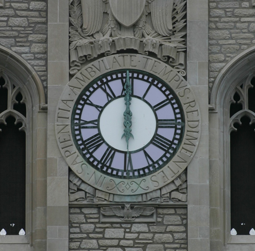
| Nice detail shot, the symmetry is spot on. Colours are perhaps a bit muted, maybe raise the gamma? Some lovely blues in the clock. |
|
| Photographer found comment helpful. |
|
|
05/18/2004 02:36:43 PM |
| Nice shot but a bit gloomy. Maybe levels could be adjusted. |
|
| Photographer found comment helpful. |
|
|
05/18/2004 11:29:20 AM |
| nice but too gray. did you try using different WB settings? |
|
| Photographer found comment helpful. |
|
|
05/17/2004 07:45:08 PM |
| The beautiful clock is nicely centered, but the bold horizontal columns keep my focus from staying on the clock with this amount of cropping. I would be interested in seeing a little more contrast or brightening applied and see how it looks; it might benefit from a little sharper detail. |
|
| Photographer found comment helpful. |
|
|
05/17/2004 10:03:31 AM |
| The cropping feels awkward in this. Also appears to be tilted counter-clockwise. |
|
| Photographer found comment helpful. |
|
|
05/17/2004 05:03:03 AM |
| A little dark on my monitor, but a good composition and technically well done otherwise. I just wish there was something in this photo to give some punch, like if the lavender of the clock face was lit up or if the lighting in general were more dramatic. As it is, the image leaves me feeling a little flat. |
|
| Photographer found comment helpful. |
Home -
Challenges -
Community -
League -
Photos -
Cameras -
Lenses -
Learn -
Help -
Terms of Use -
Privacy -
Top ^
DPChallenge, and website content and design, Copyright © 2001-2025 Challenging Technologies, LLC.
All digital photo copyrights belong to the photographers and may not be used without permission.
Current Server Time: 03/13/2025 10:43:46 AM EDT.