| Author | Thread |
|
|
05/27/2004 12:58:43 AM |
Another awesome shot dude.
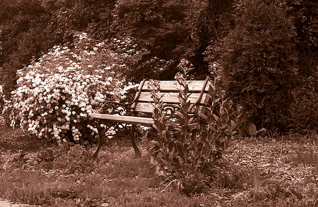
I got excited when I saw the title and the challenge, I thought maybe you went and reshot the bench down by the stadium on cedar. You know that I love that pic. |
|
 Photographer found comment helpful. Photographer found comment helpful. |
Comments Made During the Challenge  |
|
|
05/23/2004 01:20:04 PM |
| The bench doesn't grab my eye initially, the bush to the left does, thus not being centered subject. I see what you're going for though. |
|
| Photographer found comment helpful. |
|
|
05/21/2004 03:22:13 PM |
| I like the tone and warmth of the picture. Unfortunately, the contrast between the bench and surroundings make it almost disappear (which may be the effect you wnat to go with the title). |
|
| Photographer found comment helpful. |
|
|
05/17/2004 10:17:27 PM |
| I like the shot the tones and composition are terriffic. I think it is just a little too busy for this challenge. There are a lot of things going on. My eyes seem to wander between the different bushes and the bench. Awesome shot though, I love the detail that you captured on the bush to the right and behind the bench. |
|
| Photographer found comment helpful. |
|
|
05/17/2004 05:10:09 PM |
| Bit of an overdose of sepia here... too much red or magenta. Good sepia effects are usually quite subtle. Compositionally there is so much texture here, it is hard to know what to focus on. Maybe colour would have been better. |
|
| Photographer found comment helpful. |
|
|
05/17/2004 09:39:09 AM |
| I'd like to see the point of view moved to the left so I see more of the bench and it's in less competition with the flower. |
|
| Photographer found comment helpful. |
|
|
05/17/2004 08:33:50 AM |
| Bench is centered, but not balanced, this is definitely a shot that works better with the RO1/3rds, mainly because the white flowering shrubbery (NI NI NI) to the left overpowers the right side. |
|
| Photographer found comment helpful. |
|
|
05/17/2004 06:47:42 AM |
| I like sepia toning and contrast. Your main subject could be more interesting and should have been more dominant in the image to meet the challenge better (as I think you already know based on your title). Composition could be improved, I feel, if you moved slightly to the left to help bring out the bench more so that it wasn't hidden behind the near bush. |
|
| Photographer found comment helpful. |
Home -
Challenges -
Community -
League -
Photos -
Cameras -
Lenses -
Learn -
Help -
Terms of Use -
Privacy -
Top ^
DPChallenge, and website content and design, Copyright © 2001-2025 Challenging Technologies, LLC.
All digital photo copyrights belong to the photographers and may not be used without permission.
Current Server Time: 03/15/2025 05:24:16 AM EDT.