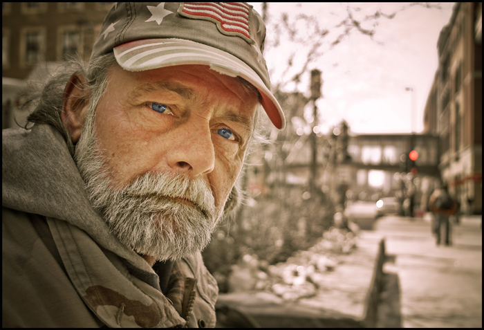
I met Robert on Nicollet Mall in Minneapolis. He was a nice guy and happy to have his picture taken. I asked if he was there often so I could return and give him a print. (I stopped by a week later, gave him a print of this shot and took a couple more.) It turned out to be a great day. I shot 3 other similar style portraits of people. See my portfolio for the other images. I was experimenting with a wider lens to show more of the environment (around 18-24mm). I'd been shooting these with a 50mm or 85mm. I think I like the wide shot to give a sense of place.
Post Processing
Lightroom 2 - crop, white balance, exposure, recovery, fill light, blacks, contrast, clarity, vibrance, desaturate, tone curve, selective desaturate, sharpen, noise reduction, vignette
Photoshop CS4 - He had intense blue eyes that I wanted to bring out in the photo so I did some selective work on just the eyes (I can't decide if I overdid it-- I'm sure the voters will tell me) -- saturation - color balance - curves, add border, save for web
Statistics
Place: 61 out of 475 Avg (all users): 6.2016 Avg (commenters): 8.2500 Avg (participants): 6.0430 Avg (non-participants): 6.6774 Views since voting: 1081 Views during voting: 229 Votes: 124 Comments: 7 Favorites: 2 (view)
I agree with choltmeier about how striking this photo is considering the blue of the eyes. What really draws me, however, is how it seemingly looks as though he is in a warzone. I know he isn't, but the nice blur imparted by the aperture choice makes it noticeable. The pedestrians looks as though they are humping packs and the overall lack of color and defintiion remind one of a warzone. Great job.
(I had this image posted in my portfolio, then decided to enter it in the Free Study challenge. I'm moving this comment from the other image so I can delete it and have only one version of the image posted.)
On 3/31/09 Iky623 wrote:
I didn't see that you had half dozen Nicollet Mall photos until today. Of all the subjects, Robert has the most "character" that would make me click the thumbnail. I like this one also for the same reasons as the other Robert image. However, I like how you caught the blue of his eyes in this image compared to the other Robert image. This image is warmer than the other image. The other one appears de-saturated a bit, don't know if you intended that for effect (accentuate the cold?) Either way nice job on both images. Nice character studies.