| Author | Thread |
|
|
04/26/2009 03:32:47 PM |
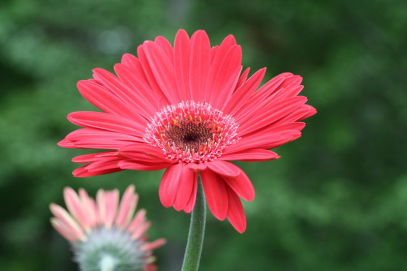
| colors do contrast very nicely and I will have to agree that the composition would be a "tad" better if your flower weren't so "centered"... |
|
|
|
04/03/2009 12:32:27 PM |
Oh, yes. you have the touch for exquisite detail in your florals. This is a good example of that. Love the bright reds and the oof flower in the background.
I do wonder if you could 'double the effect' of that gorgeous flower by deleting some of the b/g either on the right or the left. This nicely delineated flower doesn't need the center composition to make it pop.
As usual, I"m being picky on a fine image. |
|
 Photographer found comment helpful. Photographer found comment helpful. |
|
|
04/02/2009 07:29:49 PM |
| The green bokeh really enhances the red of the gerbera. What a gorgeous shade of red it is too. |
|
| Photographer found comment helpful. |
|
|
04/02/2009 01:37:53 PM |
| Nice reds. The background provides a great framing for the flower. The soft focus gives this a really nice feel. |
|
| Photographer found comment helpful. |
|
|
04/02/2009 01:23:24 PM |
| Good exposure and settings to not blow out the red in the daisy. The BG compliments the red very nicely in this shot. The red seems to remind me of something that I used to enjoy when I was a kid. Maybe it was strawberry popsicles. |
|
| Photographer found comment helpful. |
Home -
Challenges -
Community -
League -
Photos -
Cameras -
Lenses -
Learn -
Help -
Terms of Use -
Privacy -
Top ^
DPChallenge, and website content and design, Copyright © 2001-2025 Challenging Technologies, LLC.
All digital photo copyrights belong to the photographers and may not be used without permission.
Current Server Time: 03/14/2025 12:05:15 PM EDT.