| Author | Thread |
Comments Made During the Challenge  |
|
|
05/30/2004 05:43:19 PM |
| Simple and to the point, but not very interesting. (6) |
|
 Photographer found comment helpful. Photographer found comment helpful. |
|
|
05/30/2004 02:17:09 PM |
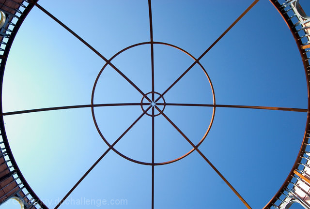
| I love the very stark graphical element ehre. Just a touch of action at the corners, and those great lines drawing me towards the center. 8 |
|
| Photographer found comment helpful. |
|
|
05/29/2004 04:39:45 AM |
| more of the surounding building would help 'set the scene' here i think |
|
| Photographer found comment helpful. |
|
|
05/28/2004 08:15:50 AM |
|
| Photographer found comment helpful. |
|
|
05/28/2004 07:19:48 AM |
|
|
|
05/27/2004 03:41:24 AM |
| clever image nice and clear |
|
| Photographer found comment helpful. |
|
|
05/26/2004 04:00:48 PM |
This is pretty cool but I would love to see more of the surrounding structure to get a better feel for what it is or to just see more details. Good colors and sharpness.
T |
|
| Photographer found comment helpful. |
|
|
05/26/2004 03:55:05 PM |
| Very clean and sharp. I like the gradient in the sky (CPOL?). |
|
| Photographer found comment helpful. |
|
|
05/25/2004 12:22:25 AM |
| lvoe the idea and the fade of the sky color but the edges are distracting, would prefer a little more of the surrounding building. |
|
| Photographer found comment helpful. |
|
|
05/24/2004 02:43:16 PM |
| great sky for half of it... would like more uniform color, but great positioning |
|
| Photographer found comment helpful. |
Home -
Challenges -
Community -
League -
Photos -
Cameras -
Lenses -
Learn -
Help -
Terms of Use -
Privacy -
Top ^
DPChallenge, and website content and design, Copyright © 2001-2025 Challenging Technologies, LLC.
All digital photo copyrights belong to the photographers and may not be used without permission.
Current Server Time: 03/13/2025 03:26:58 AM EDT.