| Author | Thread |
Comments Made During the Challenge  |
|
|
04/11/2009 04:18:10 PM |
I think I have you beat in the tacky department. (No vote yet, just browsing)
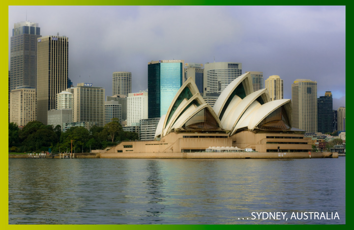
Added: Ok voting now. I can't figure out why you might consider the Sydney Opera house to be tacky. Maybe it's a Cliche shot, but if I visited Sydney, I would certainly take my share of pics of this place. Not as over-photographed as Toronto, however. But then, I believe 40% of DPC members live in Toronto. |
|
|
|
04/10/2009 09:18:23 PM |
Yep, just what you would expect on a postcard of Sydney!
I was going to go out and do a shot of the Opera house as well, but it rained all bloody week so in the end I never bothered entering anything. I see from the sky you faced the same problem :) |
|
|
|
04/09/2009 06:34:19 PM |
|
|
|
04/09/2009 05:43:27 AM |
|
|
|
04/08/2009 10:12:09 AM |
| Nice shot, but IMO the colors are dull. |
|
|
|
04/07/2009 11:41:22 AM |
| This photo should have been taken on a brighter, sunnier day. It would have helped make the postcard more inviting. |
|
 Photographer found comment helpful. Photographer found comment helpful. |
|
|
04/07/2009 06:06:39 AM |
Right on. It even looks like it was taken in 1973 :) There's postcard pints points for that. |
|
| Photographer found comment helpful. |
|
|
04/07/2009 01:47:44 AM |
| not a fan of the border although i have a feeling it goes with the title |
|
| Photographer found comment helpful. |
|
|
04/06/2009 11:54:13 AM |
| It's not as tacky as the author believes - the image is reasonably sharp, the Opera House a symbol of Sydney, the sky is kind of blah, but it does add a dramatic component to the image. The font is acceptable, but I can't think of a reason why the elipses in the front of Sydney. |
|
| Photographer found comment helpful. |
|
|
04/06/2009 09:48:21 AM |
| A little bland for colors and for Sydney but I guess we are all spoiled by those night time cityscapes. Not liking the frame color but I do like that you gave us a different perspective. |
|
| Photographer found comment helpful. |
|
|
04/06/2009 12:50:22 AM |
| the border is a little distracting and calls for attention...black would have been better |
|
| Photographer found comment helpful. |
|
|
04/06/2009 12:27:22 AM |
| I happen to think this is super pretty! |
|
| Photographer found comment helpful. |
Home -
Challenges -
Community -
League -
Photos -
Cameras -
Lenses -
Learn -
Help -
Terms of Use -
Privacy -
Top ^
DPChallenge, and website content and design, Copyright © 2001-2025 Challenging Technologies, LLC.
All digital photo copyrights belong to the photographers and may not be used without permission.
Current Server Time: 03/16/2025 07:52:35 AM EDT.