| Author | Thread |
Comments Made During the Challenge  |
|
|
04/14/2009 06:17:44 PM |
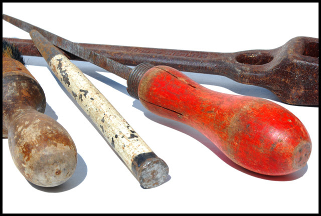
| I do like the brightness in this image but I'm not fond of the shadows. Maybe a fill light from the top right would help minimize that. Also the tool on the left might have been better placed by turning it around so that the brush is in the foreground. You have the similar textures on the other 3 tools and the shape of that one is similar to the red one so turning it around would add not only interest but bring in another texture which is lost off the screen on the left. It also looks like that one has more rust on the other end of it too. Overall well done. |
|
 Photographer found comment helpful. Photographer found comment helpful. |
|
|
04/14/2009 04:03:31 PM |
|
| Photographer found comment helpful. |
|
|
04/12/2009 10:20:21 PM |
| I like the textures on the tools, but they look so out of place on the sterile white.....7 |
|
| Photographer found comment helpful. |
|
|
04/11/2009 04:59:14 PM |
| An image that demonstates the subject matter of the challenge in spectacular fashion with excellant DOF and color control. Both a technical and artistic success that more than adequately meets the challenge subject in particular with the color shades. A very worthy contender for top ten honors and a possible ribbon contender. |
|
| Photographer found comment helpful. |
|
|
04/09/2009 08:45:32 AM |
| i think this would be more interesting if the tools were on a workbench, or in their "natural habitat" instead of a super white background |
|
| Photographer found comment helpful. |
|
|
04/08/2009 08:24:31 PM |
| I like your shot...but personally I don't like the white background it blows it out to much... |
|
| Photographer found comment helpful. |
Home -
Challenges -
Community -
League -
Photos -
Cameras -
Lenses -
Learn -
Help -
Terms of Use -
Privacy -
Top ^
DPChallenge, and website content and design, Copyright © 2001-2025 Challenging Technologies, LLC.
All digital photo copyrights belong to the photographers and may not be used without permission.
Current Server Time: 04/26/2025 12:22:20 AM EDT.