| Author | Thread |
Comments Made During the Challenge  |
|
|
04/11/2009 08:25:02 PM |
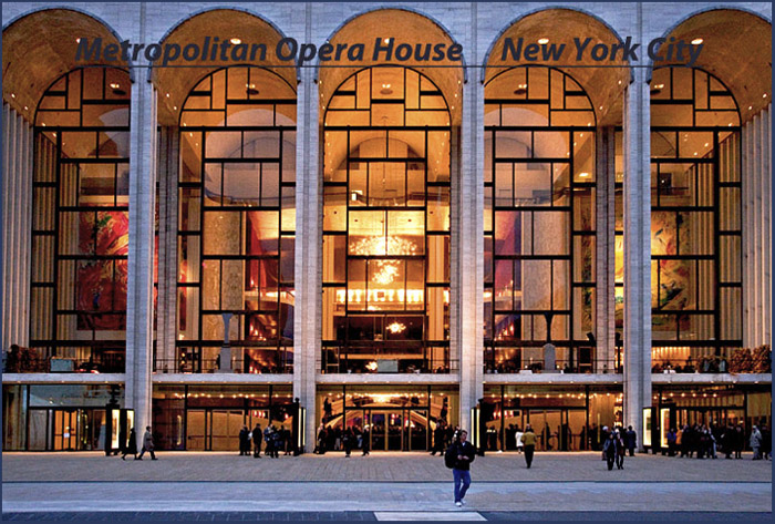
| Nice capture of the lighting and patterns. Needs a little perspective correction, especially on the left edge. |
|
 Photographer found comment helpful. Photographer found comment helpful. |
|
|
04/07/2009 06:52:47 AM |
| Doesn't look very nice. Good thing I'm not paying the architect, eh? The text gets a bit lost in there. |
|
| Photographer found comment helpful. |
|
|
04/06/2009 08:55:57 PM |
| It would have been nice to have some negative space to place the text. It doesn't really stand out as it is. |
|
| Photographer found comment helpful. |
|
|
04/06/2009 07:28:35 PM |
|
| Photographer found comment helpful. |
|
|
04/06/2009 05:22:32 PM |
| Good shot, works well as a postcard, but the color of your font gets lost in the image. |
|
| Photographer found comment helpful. |
|
|
04/06/2009 12:18:39 PM |
| nice shot but maybe a different font would helped |
|
| Photographer found comment helpful. |
|
|
04/06/2009 11:23:33 AM |
| I like the author's intent here, but the focus is softer than it should be. If it were sharper, it would have been a great image. The font selection is good, but the underline is not necessary and the color choice was less than thoughtful. It does what it's meant to do though which is represent the Met and it's majesty - it just has those few flaws that mar the overall impact. |
|
| Photographer found comment helpful. |
|
|
04/06/2009 10:02:21 AM |
| Nice composition and crop. The text kinds of blends in tho and probably should have been in yellow or white. |
|
| Photographer found comment helpful. |
|
|
04/06/2009 12:46:24 AM |
| the lettering really blends in with the building and takes away from the picture for me |
|
| Photographer found comment helpful. |
Home -
Challenges -
Community -
League -
Photos -
Cameras -
Lenses -
Learn -
Help -
Terms of Use -
Privacy -
Top ^
DPChallenge, and website content and design, Copyright © 2001-2025 Challenging Technologies, LLC.
All digital photo copyrights belong to the photographers and may not be used without permission.
Current Server Time: 03/17/2025 09:37:30 AM EDT.