| Author | Thread |
|
|
04/22/2009 12:45:34 AM |
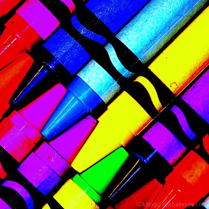
| wow! you did even worse than I did in this challenge! I'm shocked--I really liked this image. I gave it an 8! |
|
Comments Made During the Challenge  |
|
|
04/19/2009 09:40:49 PM |
| Appealing in a Warhol kind of way. The oversaturation works to good effect. |
|
 Photographer found comment helpful. Photographer found comment helpful. |
|
|
04/19/2009 08:59:46 PM |
| I appreciate your processing and your courage with this image. It might not go over very well with the masses but it's got a certain pizazz that I like. |
|
| Photographer found comment helpful. |
|
|
04/19/2009 03:07:09 AM |
| way to saturated.... everything looks faked. |
|
| Photographer found comment helpful. |
|
|
04/17/2009 08:53:15 PM |
|
| Photographer found comment helpful. |
|
|
04/15/2009 10:03:37 AM |
|
| Photographer found comment helpful. |
|
|
04/14/2009 10:07:06 PM |
| the saturation doesn't really work for me, but i like that you tried something a little out of the box. good luck! |
|
| Photographer found comment helpful. |
|
|
04/14/2009 11:22:16 AM |
| ok, where as alot of the other entries are just dull/flat yours is oversaturated.... |
|
| Photographer found comment helpful. |
|
|
04/14/2009 10:16:23 AM |
| Nice try but it's just too oversaturated for me. |
|
| Photographer found comment helpful. |
|
|
04/14/2009 09:26:20 AM |
| It's a nice shot, I think that the purple and dark blue should've been a different color. JMO! |
|
| Photographer found comment helpful. |
|
|
04/13/2009 11:50:01 PM |
|
| Photographer found comment helpful. |
|
|
04/13/2009 10:40:24 PM |
| This one is tough to judge, because as a graphic it rocks; great crop, vibrant and dynamic, it would make a great offset print. As a pure photograph the density of saturation washes out the subtle textures and I can hardly tell where the rough paper ends and the waxy crayon begins. On a different site with less obsession over technical mastery it would be a no brainer, because the image grabs you by the throat. I'm going to have to give it a provisional score and come back. |
|
| Photographer found comment helpful. |
|
|
04/13/2009 10:25:19 PM |
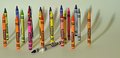
| Opinion on the post processing of this is obviously going to be a very personal thing. Not doing much for me but thank you for giving me something other than close ups of crayons in colour spectrum order. |
|
| Photographer found comment helpful. |
|
|
04/13/2009 12:26:04 PM |
| The author had a great idea, but failed to create an imact that has a positive impact. The over saturation of color doens't enhance the image's impact and is a negative. However, the idea is sound and with a little more thought on the part of the author, it would have been a top twenty image. |
|
| Photographer found comment helpful. |
|
|
04/13/2009 08:30:38 AM |
| Processing seems a bit harsh. With such a colorful subject, I find the color distortions detract from the composition. |
|
| Photographer found comment helpful. |
Home -
Challenges -
Community -
League -
Photos -
Cameras -
Lenses -
Learn -
Help -
Terms of Use -
Privacy -
Top ^
DPChallenge, and website content and design, Copyright © 2001-2025 Challenging Technologies, LLC.
All digital photo copyrights belong to the photographers and may not be used without permission.
Current Server Time: 03/12/2025 06:12:00 AM EDT.