| Author | Thread |
|
|
11/16/2009 07:55:52 PM |
Yes! I do like this one. I can't explain why I like this style of HDR, I just do. They remind me a little of Norman Rockwell illustrations. Very optimistic & upbeat & idealized. Sorry it didn't do better. Not sure how I feel about editing out the people. I like people in the shot, but it's hard to get a good artistic grouping. But they do add a sense of scale, which I like. I think you met your own goals which is what counts. Since the print is selling, that means you have captured the way people feel about this street scene, so ur doin it rite. Keep on clickin'! "D
Message edited by author 2009-11-16 21:51:18. |
|
|
|
05/10/2009 06:05:49 AM |
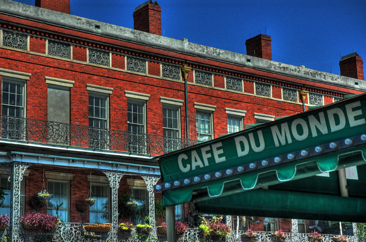
| I know there's nothing you can do about it, but my eyes keep going to the chimney stacks, and the one that is cropped...... Also there's evidence of a halo on the stacks.... |
|
 Photographer found comment helpful. Photographer found comment helpful. |
|
|
05/09/2009 11:11:21 PM |
Looking at this again I would say:
You may want to go back out to that spot with a tripod and just do an HDR on that building w/o the sign in the foreground. The ironwork, the hanging plants, the windows, and the bricks are perfect for this type of shot.
I would use a wider angle on the lens...18mm. Get as much of the building in as possible. Keep the angle on the building about the same...maybe move a little more to your "left" and shoot towards the right.
I live in N.O. - I may take a shot at it myself one day. |
|
| Photographer found comment helpful. |
|
|
05/09/2009 06:27:35 PM |
Didn't come up for me in voting, but I think I would have given it a 5. I think you did well with the HDR. It's got a lot of good detail and the colors are strong but not overdone. I think where this falls down is in the composition. It does not quite lead my eye to a central subject. My eye wants to go up to the windows, as that is where the lines are leading me, but the flowers and interesting ironwork beneath them are drawing me down there. The end result is my eye wanders around the image a bit. To my perception, it's not to too different from your first entry in some ways.
The angle and colors are similar, and in the earlier shot, my eyes were taken away from the subject by the background that was in competition with it.
Message edited by author 2009-05-09 18:28:38. |
|
| Photographer found comment helpful. |
|
|
05/09/2009 05:47:54 PM |
I just noticed this thread and beings I started a HDR Photo Side Challenge I would like to comment. I never got to vote on this image but if I had, I would have scored it a 6 based on the clarity of the elements and the precision involved. It has nice opposing lines and strong color. There is nothing wrong with this image so the score must have been a result of personal taste. It appears somebody gave it a 1 and somebody a 10 but most scored it 5.
You did an excellent job and it should have scored higher. As for the halos around the chimneys, I barely see them on my new laptop screen and I'm ruinning Vista so I can see most imperfections. I don't think that should have been a problem. I really think it was more esthetics and POV (point of view) than anything else. I think had you perhaps taken another view and played up the florals more it might have attracted more people. I, for one, would like to see more of the wonderful flower baskets and planters that seem to have gotten lost at the bottom of the image, that's just me but I wouldn't be surprised if others felt the same way.
Next time, try your potential entry out in a side challenge first and see what people have to say about it. It's a great borometer for predicting how an image will score. |
|
| Photographer found comment helpful. |
|
|
05/08/2009 09:33:09 AM |
A lot of this will be down to taste, but for me the benefit of HDR is the chance to expose more of the picture correctly, while maintaining the look of a photo. I have seen HDRI used very effectively to produce a slightly 'cartoon' image as you have here but it leaves me a little cold.
I would also recommend processing to avoid the halos around the chimney (a common sign of excessive use of the shadow/highlight tool as well I have found) and the slightly over saturated colours.
To me it actually doesn't look that crisp - the lines are sharp but thick, which I often also find a problem when I am trying HDR and my photos are not exactly in line (from manual rather than remote shutter normally!)
As to why it didn't score well, I just don't think it is to DPC taste. If you look at the front page, the photos tend to be sunsets/landscapes or action shots of this and that. Do one of those and you can get away with all sorts of technical failures (mentioning no names on a recent challenge!) |
|
| Photographer found comment helpful. |
|
|
05/08/2009 08:48:17 AM |
| This might warrant a 6-7 from me in voting. The colors are too vivid for me. I love the HDR effect, but I'm also sort of finicky about the results that appeal to me. Mostly I just want a beignet now... =] |
|
| Photographer found comment helpful. |
|
|
05/08/2009 08:01:28 AM |
I didn't vote on this challenge, but I would have waviered between a 5-6. ...I love the detail metal lace ironwork (I'm sure it's got an engineering name that I don't know). The ironwork is the softness in the image, and make a nice contrast against the brickwork.
The negatives for me are; the main focus is the sign, which is, just, not that interesting. If the lights underneath it were alight, it would have illuminated it.....and for my taste it is over saturated....too much colour....on the bricks & the garden, and on the sky.
Remember JMHO, and I have learnt a lot from people who don't know it all, they just know what they like.....and are willing to tell you what and why....and they are the voters...
PS I'm hanging out to get a HDR program.....so... enjoy playing....and remember to have fun, and it's all just pixels....:)
|
|
| Photographer found comment helpful. |
|
|
05/08/2009 07:28:44 AM |
I didn't vote but I think I would have been going for the 5 button.
The first thing I notice is the halos around the chimneys which are distracting and the sky is a little too dark for the rest of the lighting and a little noisy (you could just select the sky (allowed in advanced only) and run a heavy noise routine on it depending what software you are using).
The rest of the scene is just a tiny bit over processed for my tastes and I'd just like it to be toned down a fraction. The lighting on the building is uneven which looks like more halo effect (though I could be wrong) maybe you could post your original? Maybe turning up the light smoothing in the HDR software.
The text on the sign leads you straight out of the photo, it would be better (though maybe not possible) to have the whole shot reversed so the text would be on the left and lead you into the shot.
I think the whole crop is a little tight, especially on the awning, the awning blends into the building behind. Maybe slightly wider or even fill the frame more with the awning. Maybe a different angle, I find the shot is a bit flat, maybe the street going off into the distance would lead you into the shot more and give a more 3d feel to it.
all IMHO of course! |
|
| Photographer found comment helpful. |
Comments Made During the Challenge  |
|
|
05/07/2009 09:27:28 PM |
Must... have... beignets... (one thing I miss about living there.)
Great shot. Love the POV and the angle. I swear I see Mardi Gras colors in the rows of hanging planters. |
|
| Photographer found comment helpful. |
|
|
05/07/2009 07:38:23 PM |
| Quite overprocessed in my opinion. Its a nice looking image but it really doesn't look like a photograph any more. |
|
| Photographer found comment helpful. |
|
|
05/07/2009 12:51:23 PM |
| Yes it is. And the beignets are the main reason to go there. Don't wear black - that powdered sugar gets all over everything! :-) Nice pop in the colors, good framing. |
|
| Photographer found comment helpful. |
|
|
05/03/2009 07:22:25 PM |
| I just enjoyed my first beignet there in March. What a popular place! |
|
|
|
05/01/2009 09:39:32 PM |
| A solid image that is crisp, sharp and properly framed and composed - a technical success in every way. From an artistic standpoint, it has significant impact being richly colored with excellant detail. This image would have worked as a black and white as well. A perfect demonstration of the power of properly controlled light and focus. A top ten image and a very strong contender for a ribbon. Well done. |
|
| Photographer found comment helpful. |
|
|
05/01/2009 10:43:28 AM |
|
| Photographer found comment helpful. |
|
|
05/01/2009 09:59:48 AM |
| The only thing I can even remotly say voters don't like is the "crop". |
|
| Photographer found comment helpful. |
Home -
Challenges -
Community -
League -
Photos -
Cameras -
Lenses -
Learn -
Help -
Terms of Use -
Privacy -
Top ^
DPChallenge, and website content and design, Copyright © 2001-2025 Challenging Technologies, LLC.
All digital photo copyrights belong to the photographers and may not be used without permission.
Current Server Time: 03/14/2025 06:16:58 AM EDT.