| Author | Thread |
|
|
11/11/2002 05:42:00 AM |
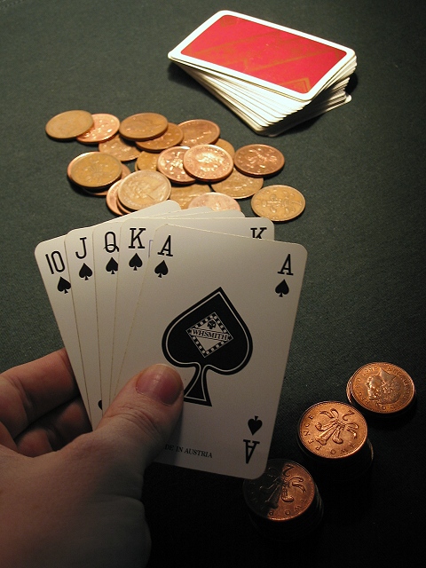
Quite a few of you mentioned the lighting, some liking, others not. The reason I chose it to look like it does is that that's how a card table *should* be lit! The strong light in the centre over the deck & the pot, allowing the card players and their cards to hide in the gloom :o)
Oh, and the reason I used 2p coins instead of £20 notes is that the coins looked better in the light, and added more colour to the scene, whereas the notes (which I did try) made if fell a bit flat ;o) |
|
Comments Made During the Challenge  |
|
|
11/09/2002 06:27:00 PM |
| Ever noticed how "luck" is a lady no matter what country you are in. Pretty good photo. I don't understand your choice of lighting but it does add mistique. Do feel there is going to be disagreement on your choice of focus point. But for me it is fine. Not exciting but a good shot. |
|
|
|
11/06/2002 06:23:00 PM |
| You could have used a bit more light on the cards. |
|
|
|
11/05/2002 09:09:00 PM |
| Good job with the lighting. |
|
|
|
11/05/2002 02:11:00 PM |
| a great hand wasted on a crappy kitty, now if they were £20 notes then it would be worth it. |
|
|
|
11/04/2002 05:45:00 PM |
| Good layout and composition. Lighting gives a good feel to the shot. |
|
|
|
11/04/2002 04:18:00 PM |
| Nice lighting, beautiful coins. Well done. Justine |
|
|
|
11/04/2002 08:24:00 AM |
| Would like to see a bit more light on the cards. |
|
|
|
11/04/2002 01:30:00 AM |
| Very nice composition and focus. DPz |
|
|
|
11/04/2002 12:33:00 AM |
| That looks like a winning hand! Nice idea. |
|
Home -
Challenges -
Community -
League -
Photos -
Cameras -
Lenses -
Learn -
Help -
Terms of Use -
Privacy -
Top ^
DPChallenge, and website content and design, Copyright © 2001-2025 Challenging Technologies, LLC.
All digital photo copyrights belong to the photographers and may not be used without permission.
Current Server Time: 03/12/2025 12:55:25 PM EDT.