| Author | Thread |
Comments Made During the Challenge  |
|
|
05/30/2004 11:33:30 PM |
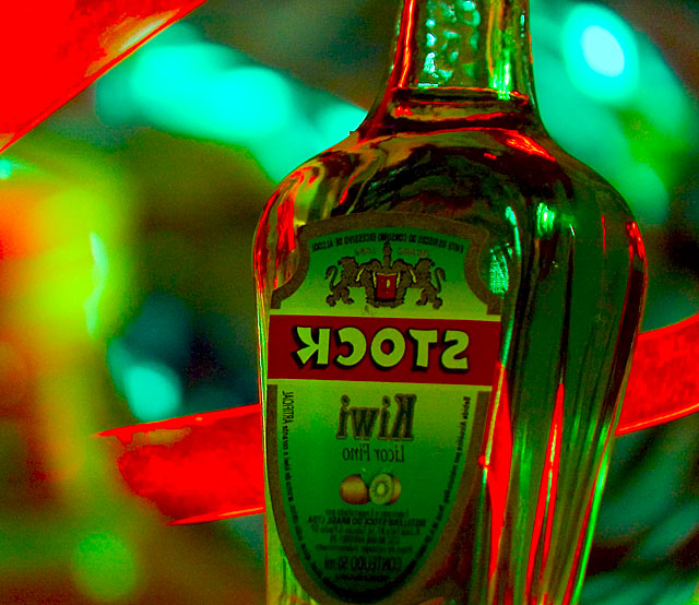
| I think this image is hurt by the reversal of letters on the label. It creates a distraction that doesn't add to the main subject. I think the colors are bold and appealing. |
|
|
|
05/28/2004 08:13:36 PM |
|
|
|
05/28/2004 10:35:04 AM |
| I really like the colors and composition in this shot but ... you loose a point for having all the type on the bottle backwards. If this is some sort of mirror image it is not clear and detracts from the whole. |
|
|
|
05/28/2004 04:57:44 AM |
| Nice photo, interesting colour and well arranged contrast. Final image is over optimised, try making the dimensions smaller if there's no other way to keep the file size down. 6 |
|
 Photographer found comment helpful. Photographer found comment helpful. |
|
|
05/27/2004 04:24:27 PM |
| oops... the slide is in backwards. |
|
|
|
05/27/2004 12:16:16 AM |
| I really love the colors you were able to capture in this shot. It's a bit grainy and I don't think it improves the shot to have the bottle on that slight tilt (maybe a greater tilt ?), but this is a beautiful photo. Nice job! |
|
| Photographer found comment helpful. |
|
|
05/26/2004 10:22:14 AM |
| Why is the label backwards? |
|
Home -
Challenges -
Community -
League -
Photos -
Cameras -
Lenses -
Learn -
Help -
Terms of Use -
Privacy -
Top ^
DPChallenge, and website content and design, Copyright © 2001-2025 Challenging Technologies, LLC.
All digital photo copyrights belong to the photographers and may not be used without permission.
Current Server Time: 04/27/2025 12:24:24 AM EDT.