| Author | Thread |
|
|
05/08/2009 10:08:27 PM |
Originally posted by cgino:
What do you use to process your image? Here's a quickie done in Photoshop CS3; just increased the dark tones using levels and added a texture...
Your image really is wonderful!! |
Thanks for the encouragement. I have Photoshop, v. 5. Just don't know how to use it. It feels very overwhelming. Like your variation. |
|
|
|
05/08/2009 07:06:45 PM |
What do you use to process your image? Here's a quickie done in Photoshop CS3; just increased the dark tones using levels and added a texture...
Your image really is wonderful!! |
|
 Photographer found comment helpful. Photographer found comment helpful. |
|
|
05/08/2009 06:44:03 PM |
Originally posted by cgino:
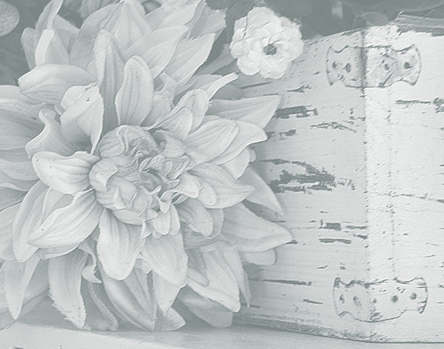
I really like the combination of the flower and the aged box. NICE!! And I love the bit of blur too! But I have to admit I'm with  tph1 and would like to see more contrast; more specifically, more dark tones. In general the effect of the gradient filter is really nice, but if this were my image I would continue to process it with a levels layer to darken those dark tones. If you don't want more contrast, then either think of using this as a texture layer or cool background as tph1 and would like to see more contrast; more specifically, more dark tones. In general the effect of the gradient filter is really nice, but if this were my image I would continue to process it with a levels layer to darken those dark tones. If you don't want more contrast, then either think of using this as a texture layer or cool background as  KarenNfld suggested, or even add a layer on top of it to grunge it up a bit and add more interest as we do in this thread. Bottom line is I see a lot of good to work with here! KarenNfld suggested, or even add a layer on top of it to grunge it up a bit and add more interest as we do in this thread. Bottom line is I see a lot of good to work with here! |
Great ideas. I really don't understand how to use layers. Still getting familiar with my tech stuff! Maybe I should try that next. |
|
|
|
05/08/2009 06:43:10 PM |
Originally posted by KarenNfld:
I think it would make a lovely background for a poem or invitation. As a stand alone image I think it's too light, sorry. |
No apology necessary. Thanks for your honest opinion. |
|
|
|
05/08/2009 06:34:55 PM |
| I really like the combination of the flower and the aged box. NICE!! And I love the bit of blur too! But I have to admit I'm with tph1 and would like to see more contrast; more specifically, more dark tones. In general the effect of the gradient filter is really nice, but if this were my image I would continue to process it with a levels layer to darken those dark tones. If you don't want more contrast, then either think of using this as a texture layer or cool background as KarenNfld suggested, or even add a layer on top of it to grunge it up a bit and add more interest as we do in this thread. Bottom line is I see a lot of good to work with here! |
|
| Photographer found comment helpful. |
|
|
05/08/2009 05:46:08 PM |
| I think it would make a lovely background for a poem or invitation. As a stand alone image I think it's too light, sorry. |
|
| Photographer found comment helpful. |
|
|
05/07/2009 08:12:45 PM |
Soft, yes. I like it. But I would like to see it with some darker blacks. I would'nt necessarily lighten up the whites though.
When I first joined this site I entered a few challenges and got hammered. I left for a couple years but of course came back. Don't let the negative comments or interpretations bother you. They are normal and will always be there. |
|
| Photographer found comment helpful. |
|
|
05/07/2009 07:28:22 PM |
I like it. It is reminiscent of a pencil drawing. Since it has this particular look, and is probably intended to, I think the soft contrast is appropriate. And I like the juxtaposition of the fresh and perfect flower aginst the grungy old box.
Don't some of those challenge comments make you cringe? Pretty mean really. I missed a few challenges after the texture one, coz I really liked my picture but several voters gave it a 2. (It got a 10 as well) So I s'pose I was sulking too - or licking my wounds. |
|
| Photographer found comment helpful. |
Home -
Challenges -
Community -
League -
Photos -
Cameras -
Lenses -
Learn -
Help -
Terms of Use -
Privacy -
Top ^
DPChallenge, and website content and design, Copyright © 2001-2025 Challenging Technologies, LLC.
All digital photo copyrights belong to the photographers and may not be used without permission.
Current Server Time: 03/13/2025 05:22:49 AM EDT.