| Author | Thread |
Comments Made During the Challenge  |
|
|
06/01/2004 08:10:50 AM |
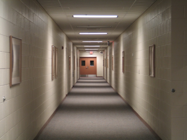
| initially, this is to me a very striking image. the pattern of light and shadow is interesting and works well. on closer study, it seems a pity that the doors at the far end weren't cemtred; they kind of knock your symmetry a bit off-kilter. also, some sort of support for your camera (a tripot, video box set, something like that) might have produced a less fuzzy image. in all though; it's a good subject, fits the challenge and very likeable. 7. |
|
|
|
05/31/2004 10:34:15 PM |
| Looks like something out of a horror film! Cool! |
|
|
|
05/30/2004 09:52:40 PM |
| I like the starkness of it. And I love the pattern to the light. |
|
|
|
05/30/2004 06:18:38 PM |
| this brings me back great shot well seen |
|
|
|
05/30/2004 12:09:00 PM |
Clearly meets the challenge but I don't find anything interesting going on. The centered door (not really the subject of the photo?) draws attention away form the light and shadow. I suppose I could be interested in what's behind the door, but the photo doesn't really force me to ask the questioon.
Sorry, may just be too esoteric for my taste. |
|
|
|
05/29/2004 05:34:59 PM |
| We have all seen this kind of hallway. Good picture. |
|
|
|
05/29/2004 05:22:26 AM |
| great shot except for the rather ugly and offset doors...maybe someone should have been walking in/out?? |
|
|
|
05/29/2004 12:49:53 AM |
| Good lighting, but sort of boring subject matter. |
|
|
|
05/27/2004 09:15:24 PM |
| Seems fairly static. Has some nice rhythm and patterns with the shadows, bricks, pictures, and so on, but not sure what it's really trying to say. |
|
|
|
05/27/2004 02:22:27 PM |
| Great shot - although looks a little soft at the door (with good focus I expect you could read the sign hanging from the ceiling in red). |
|
|
|
05/27/2004 05:51:51 AM |
| This is a good idea, but your choice of subject is a little dull and flat. A little more work in photshop might bring the colours up. The idea shows that you have an eye for the subject though - looking forward to seeing more work from you. |
|
|
|
05/26/2004 11:00:44 PM |
| more contrast might have brought out the title more... |
|
|
|
05/26/2004 05:04:27 PM |
| I find the off center door and soft focus are a bit distracting in this shot. |
|
|
|
05/26/2004 04:26:33 PM |
| Love the pattern cast from the lights. Mesmerizing! |
|
|
|
05/26/2004 12:45:28 PM |
| Had this been more in focus, it would have rated higher by me. |
|
|
|
05/26/2004 11:52:08 AM |
| Very good, nice focus, the alternat light/shadow seem to actually draw you into this picture. |
|
|
|
05/26/2004 08:48:01 AM |
Fantastic. this would have scored a 10 from me in any other competition. but there a just a couple better.
9
Good clear clean shot.
I love it |
|
|
|
05/26/2004 01:23:57 AM |
| I definately like the 3D box depth look, very good framing. |
|
|
|
05/26/2004 01:09:23 AM |
| composed very nicely. simple, yet interesing. the shadows really make the shot. |
|
|
|
05/26/2004 01:09:00 AM |
| I wish this was sharper, however it's a wonderful (if somewhat disturbing) take on the challenge. |
|
|
|
05/26/2004 12:33:15 AM |
| its a nice foto, but in my opinion it should be more focused! |
|
Home -
Challenges -
Community -
League -
Photos -
Cameras -
Lenses -
Learn -
Help -
Terms of Use -
Privacy -
Top ^
DPChallenge, and website content and design, Copyright © 2001-2025 Challenging Technologies, LLC.
All digital photo copyrights belong to the photographers and may not be used without permission.
Current Server Time: 03/12/2025 08:29:03 AM EDT.