| Author | Thread |
|
|
11/20/2009 06:00:18 PM |
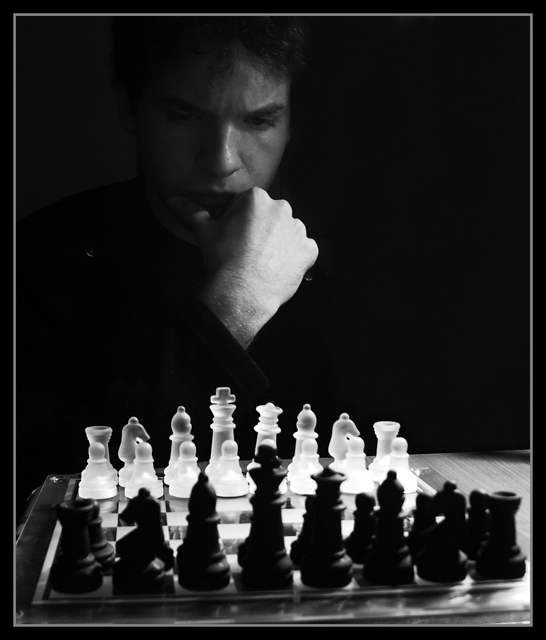
| really like the lighting on this |
|
 Photographer found comment helpful. Photographer found comment helpful. |
Comments Made During the Challenge  |
|
|
05/12/2009 10:37:02 PM |
| You shouldn't have to think so hard about the first move. |
|
| Photographer found comment helpful. |
|
|
05/12/2009 09:34:21 PM |
| Good lighting and well framed although I thought the white specs on his shoulders were dust on my monitor. |
|
| Photographer found comment helpful. |
|
|
05/11/2009 05:53:10 PM |
| I like the dualism in this photo, the symmetrical black and white effect in the horizontal and vertical way and especially like this guy's face and expression, for sure I find him very beautiful =) |
|
| Photographer found comment helpful. |
|
|
05/07/2009 09:22:34 PM |
| It's often the little things that can affect an image either positively or negatively. While not a major issue, the nit pick in this case is the little white spots on the shoulders of the subject - they are out of place and distracting to the eye. Effectively lighted, the impression is positive and while the little highlights akin to hot pixels are annoying, it is still an effective presentation. More attention to the little highlights would have made this a better image. The original rating of 7 was a little harsh given the other positive aspects, so it has been rerated to an 8. |
|
| Photographer found comment helpful. |
|
|
05/06/2009 01:27:08 AM |
|
| Photographer found comment helpful. |
Home -
Challenges -
Community -
League -
Photos -
Cameras -
Lenses -
Learn -
Help -
Terms of Use -
Privacy -
Top ^
DPChallenge, and website content and design, Copyright © 2001-2025 Challenging Technologies, LLC.
All digital photo copyrights belong to the photographers and may not be used without permission.
Current Server Time: 03/11/2025 02:09:37 PM EDT.