| Author | Thread |
Comments Made During the Challenge  |
|
|
05/19/2009 12:52:01 PM |
| i dont like the color of the font here, it makes the green look too bright or something. not sure if something else makes me dislike this, but it just doesnt grab me |
|
|
|
05/18/2009 09:29:36 AM |
| Although as a poster, this works, I wish the subject was a little more attractive. |
|
 Photographer found comment helpful. Photographer found comment helpful. |
|
|
05/16/2009 10:14:19 AM |
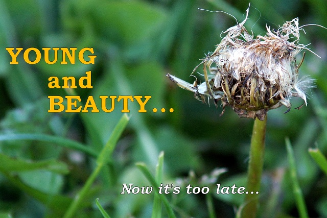
| "Youth and Beauty" OR "Young and Beautiful"?? |
|
| Photographer found comment helpful. |
|
|
05/14/2009 11:43:38 PM |
It presents ruin and destruction to me rather than aging,
Can't really age while it is still green,
The concept it self is good one, but more efforts can be put in the execution, keep up the good work, 6 |
|
| Photographer found comment helpful. |
|
|
05/14/2009 08:11:08 PM |
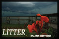
| Good macro shot. The writing over the shot is a little off putting and the message doesn't seem to have the de-motivating effect. |
|
| Photographer found comment helpful. |
Home -
Challenges -
Community -
League -
Photos -
Cameras -
Lenses -
Learn -
Help -
Terms of Use -
Privacy -
Top ^
DPChallenge, and website content and design, Copyright © 2001-2025 Challenging Technologies, LLC.
All digital photo copyrights belong to the photographers and may not be used without permission.
Current Server Time: 03/14/2025 06:28:46 AM EDT.