| Author | Thread |
Comments Made During the Challenge  |
|
|
06/01/2004 10:06:32 PM |
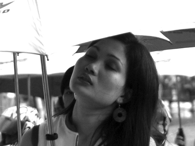
| This doesn't seem to tie into the theme very strongly. |
|
|
|
05/27/2004 09:17:49 PM |
| I think this would work better cropped tighter to get rid of the sky. Nice B&W, the soft background gives a good feeling of motion. |
|
|
|
05/26/2004 07:29:22 PM |
| a bit washed out at top of image good grab shot though ? |
|
|
|
05/26/2004 11:43:03 AM |
| I wish I could make out more detail in her face, especially around the eyes. Interesting subject. Contrast adjustment might help. The umbrella seems a bit blown out, along with some areas in the BG. |
|
|
|
05/26/2004 02:45:50 AM |
| I don't see multiple sources of light. |
|
Home -
Challenges -
Community -
League -
Photos -
Cameras -
Lenses -
Learn -
Help -
Terms of Use -
Privacy -
Top ^
DPChallenge, and website content and design, Copyright © 2001-2025 Challenging Technologies, LLC.
All digital photo copyrights belong to the photographers and may not be used without permission.
Current Server Time: 03/12/2025 08:12:10 AM EDT.