| Author | Thread |
|
|
06/18/2009 04:33:04 PM |
Greetings from the critique club!
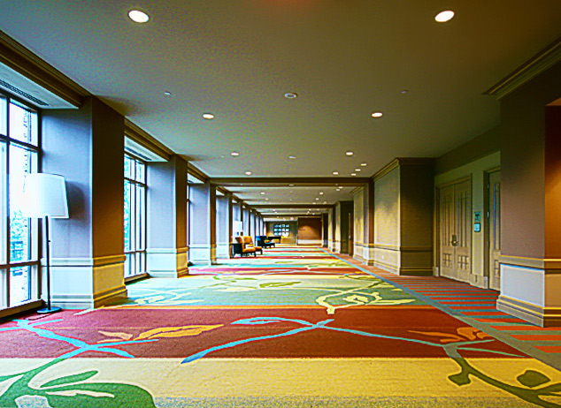
This is a tough scene to expose for and as a result only the right most quarter of the image is exposed well. You may have been able to move to the far left and try to line up the columns between the windows to minimize the brightness on the left. (Basically to eliminate the windows).
Looking at your settings you used a pretty slow shutter. The image is a little soft so a tripod might have been necessary (the softness might have come from proccessing too). Ideally, you'd also want to use a small aperture like f/22 to get more depth of field. If anything you could have used the floor for support and in fact that would have created a more interesting angle.
The processing on this has a lot of artifacts. It almost seemed like you were trying to push the image a little too much. (I myself am really guilty of this). Processing is like makeup for a woman. If you apply too much it looks gaudy and cheap. It should subtle and not noticable. (Again, I am bad for the "too much" category myself).
The scene does have great potential and you do show off what caught your eye. I like the leading lines in the shot that really provide depth and the colors are great. If you are to reshoot this I'd try a vertical and just concentrate on the right half of the scene you've presented here. As I mentioned earlier that part is exposed well. You'd still retain the leading lines and the great colors without having the washed out look of the left side.
In terms of the challenge? It meets it but it is kinda blah as an architectural piece. Its really just a hall way and not really a remarkable one. The carpeting and the warm colors of the walls are nice but I guess what I am saying is the structure itself isn't remarkable.
|
|
Comments Made During the Challenge  |
|
|
06/16/2009 02:57:51 PM |
| Sorry rather too out focus, nicely lined up and good colours but not enough to justify the shot for me. Curves would have been better. |
|
|
|
06/14/2009 09:35:21 PM |
| The composition is great, but the processing is problematic. I can't say exactly why though. The colors are off and there's some strange noise on the ceiling. It's also very soft. |
|
 Photographer found comment helpful. Photographer found comment helpful. |
|
|
06/14/2009 10:46:21 AM |
| This seems over processed to me. I like the composition very much. But, the image quality is too poor to score really well, I fear. Look at the ceiling... Still, there is much to be said for perfect composition. You have 'the eye'. :) |
|
| Photographer found comment helpful. |
|
|
06/12/2009 12:25:13 AM |
| the angle is good, but the light and color seem a little blown out |
|
| Photographer found comment helpful. |
|
|
06/11/2009 09:34:11 AM |
| Nice image for this challenge. How did you keep the focus so clear for that distance? |
|
Home -
Challenges -
Community -
League -
Photos -
Cameras -
Lenses -
Learn -
Help -
Terms of Use -
Privacy -
Top ^
DPChallenge, and website content and design, Copyright © 2001-2025 Challenging Technologies, LLC.
All digital photo copyrights belong to the photographers and may not be used without permission.
Current Server Time: 03/14/2025 03:56:09 PM EDT.