| Author | Thread |
|
|
06/23/2009 07:39:04 AM |
Greetings from the Critique Club :)
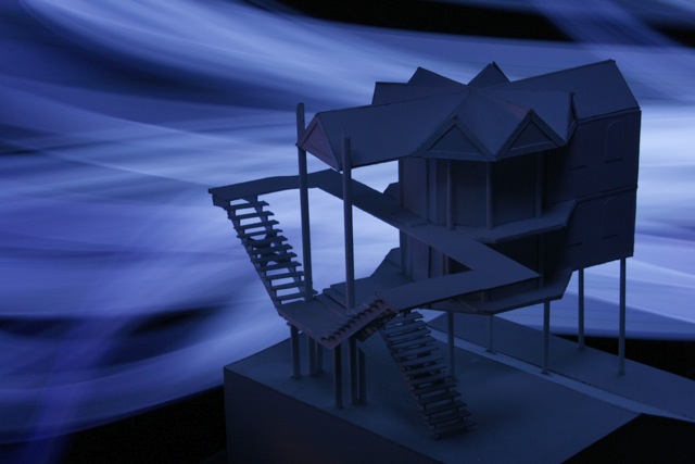
Composition:
I quite like the composition of this shot, the building sits quite nicely amongst the light, but for (as I said in my previous comment) the light is just a bit too overpowering and the building not quite illuminated enough.
Technicals:
A long exposure with 400 ISO on this type of shot is all about the light painting really and not so much about the technicals regarding camera settings so not much I can comment on really, especially as I already touched on this above.
Post-Processing:
Taking the image into photoshop I see that a shadow / highlights & then a brightness / contrast adjustment starts to bring out some detail in the front of the building which definitely helps pull off the overall concept of the image, bear in mind that even in basic editing there are some drastic changes you can make to an image.
My Opinion:
As I mentioned at the beginning I quite like this shot, I think it's an original take on the challenge and the lighting was quite creative although I feel it needed some refining. I see you have only entered two challenges so far and both entries are pretty bold entries and not within the mainstream of DPC style shots, this is great but do expect to take some knocks to your scores (although when you hit it right you could fair very well by taking this route).
Hope this was of some use, should you wish to discuss any part of the critique further please feel free to PM me.
Good luck in future challenges!
Mark |
|
|
|
06/18/2009 12:28:05 AM |
| Hey guys Thanks for the votes. This will defiantly boost my confidence (me being amateur and all) even though it was only 56th. I will be turning out even better ones as time goes! |
|
Comments Made During the Challenge  |
|
|
06/15/2009 05:54:09 AM |
| Hmmm a point or two for creativity here, but I cannot score it high, it's a model I assume so I would have liked a little more detail from this side as it is the brightness of the light behind detracts far to much (for me) only a 4 sorry :( |
|
|
|
06/14/2009 09:22:20 PM |
| Original take on the challenge. |
|
|
|
06/14/2009 11:39:45 AM |
| cool shot and swirls in the background - but it seems to lack a bit of contrast and lighting on the front of the model to really jump out at us. |
|
|
|
06/11/2009 07:01:00 AM |
| Nice idea and good model. One of the better ones in this challenge. But I feel the model is a bit underexposed. It needs an extra kiss of light to make it pop. |
|
Home -
Challenges -
Community -
League -
Photos -
Cameras -
Lenses -
Learn -
Help -
Terms of Use -
Privacy -
Top ^
DPChallenge, and website content and design, Copyright © 2001-2025 Challenging Technologies, LLC.
All digital photo copyrights belong to the photographers and may not be used without permission.
Current Server Time: 03/12/2025 07:47:13 AM EDT.