Photo was taken for the Street Photography In Color contest. I used a Gorilla Pod to place the camera very low to the ground to gain this perspective. With the camera set to manual and RAW, I selected f/16, ISO 100, and 25" to gain maximum DOF and a long exposure time to minimize noise and maximize all available light.
In post, using Adobe Lightroom 2.4, I added a small amount of warmth to the image, followed by a slight color correction to bring out the various purplish-hues. My tone settings were EV +0.42, Recovery 99, Fill Light +15, and Blacks 8. Brightness +62, contrast +61. Clarity +58, vibrance +38, saturation +4. In the tone curve, I dropped down the darks by -9 and brought up the lights +7. Finally, I added some sharpening and brought the masking to 0.
Statistics
Place: 64 out of 137 Avg (all users): 5.2279 Avg (commenters): 5.0000 Avg (participants): 4.8947 Avg (non-participants): 5.3481 Views since voting: 937 Views during voting: 341 Votes: 215 Comments: 2 Favorites: 0
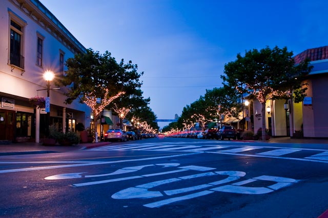
First Impressions I like the leading lines, the trail lights of the car and the fact this is a semi night shot. I also like the stop sign.
Photograph Information, Technicals & Composition Review Just read your Photographer's Comments and commend you for your thoroughness in explaining your steps both to take the image and also in post processing.
So how does all that come across as a final image to me, the viewer? - the image seems to be struggling with an identity - I like the stop sign, yet it is not dominant enough to be a feature, the trees/tree lights are nice, but again, they're not dominant enough to make an impact. The composition of the subjects doesn't seem strategic, leaving them all competing for attention.
The street is empty of people (seemingly) and there is nothing grabbing my attention - save for the stop sign (but it needs lighting) and the trailing vehicle lights. A variation in crop and composition, possibly even going for a bold crop and completely recomposing the image. For example: losing the stop sign and also cropping close to the left 'flared' light or keeping the stop sign and cropping out the light on the left and almost centering the trees. Small details like a more refined crop bottom right (red thing creeping in) also help refine the image.
Comments, Score & Placement Review 64/135 and 5.22 is about middle of the road - the perspective is good, but my guess is that the vantage point - the scene on the street, was a bit straight on and doesn't lead the eyes anywhere in particular, therefore your viewers didn't linger long.
Only one comment, but it tells two helpful things: the viewer liked the overall feel with the image (lights, colors (I'm guessing)) and that they appreciated the low angle.
Summary The stop sign makes me want to see something contradictory in the scene, but I don't - well perhaps the car passing off into the distance - but the crop is not tight enough to bring these aspects/elements into play enough. Experiment with the cropping and overall feel from the image and I think you'd produce something to hold the voters a while longer and also urge people to make a comment (hopefully helpful).