| Author | Thread |
|
|
06/09/2004 06:45:01 AM |
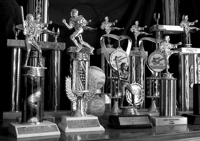
| Thanks for the feedback on my shot, the color version of this photo was just way to busy, in hind site I should have taken some of the trophies out and made this shot less cluttered. I do think this pic was one of the more original ones for the challenge. Just my 2 cents. Thanks! |
|
Comments Made During the Challenge  |
|
|
06/08/2004 08:53:40 PM |
| Emily sure is busy, ain't she? |
|
 Photographer found comment helpful. Photographer found comment helpful. |
|
|
06/08/2004 04:32:55 PM |
| i'm not sure i like this in B&W.. you could have used some sunset light through the window and gotten a very cool warm lighting effect with the brassy tones of the trophies.. |
|
| Photographer found comment helpful. |
|
|
06/07/2004 06:08:58 PM |
| The karate forms are individual sports, no? Thi s is a unique idea. |
|
| Photographer found comment helpful. |
|
|
06/07/2004 04:54:53 PM |
|
| Photographer found comment helpful. |
|
|
06/05/2004 11:02:14 PM |
| Nice collection, a triple threat.. Nice lighting and tones. I think that if you were not completely showing the taller of the trophies that you might have removed them. Otherwise quite nice. |
|
| Photographer found comment helpful. |
|
|
06/05/2004 01:44:20 PM |
| Most of the trophies are for indivdual sports. You really have to look to see the baseball and football trophies. The baseballs made me take a longer look. |
|
|
|
06/04/2004 10:57:20 PM |
|
|
|
06/04/2004 06:16:19 PM |
| Wow - how many sports? Good work on the trophies. |
|
| Photographer found comment helpful. |
|
|
06/03/2004 04:44:15 PM |
| Pretty good representation ... thinking outside the box but still it illustrates the spirit of the challenge. Black and white treatment harkens for times gone by ... |
|
| Photographer found comment helpful. |
|
|
06/03/2004 02:13:05 PM |
| This one falls a bit flat with me, unfortunately. I'm trying to figure out why. Maybe if it was composed slightly different - with some of the trophies piled up to the right or lef t- maybe using the rule of thirds a bit and allowing the use of a bit more negative space on top or to the right or left. The trophies seem very shiny and I'm wondering the light source you were using. Maybe there's no way to get around it. Maybe a reflector and lighting away from the subject would have helped a bit. Like it in black and white though. |
|
| Photographer found comment helpful. |
|
|
06/03/2004 02:04:14 PM |
| This subject doesn't have universal appeal. Emily and her family might find it a subject they would want to go back to more than once but for the casual viewer it is fairly mundane. The other problem is several sports are represented here. You need a more unified theme. Perhaps if you had showcased a single trophy with an item of paraphanalia from the sport and used dramatic lighting and a simple background you might have a good still-life with broader appeal. |
|
|
|
06/03/2004 10:17:46 AM |
| I would have left out the martial arts trophies. it's really not a team sport. Nice idea though. Since the trophys are so pretty, I really think color would have been a better choice. I am giving you an 8 for originality. |
|
| Photographer found comment helpful. |
|
|
06/02/2004 05:43:20 PM |
| a little too shiny and metallic, but unique idea, so points for that :-) |
|
| Photographer found comment helpful. |
|
|
06/02/2004 01:49:04 AM |
| Seems a tad cluttered with no real focal point but certainly conveys a lot of accomplishment. |
|
| Photographer found comment helpful. |
|
|
06/02/2004 01:08:20 AM |
| Great take on the challenge. I am glad you chose black & white. I believe all of the different colors would be distracting. |
|
| Photographer found comment helpful. |
Home -
Challenges -
Community -
League -
Photos -
Cameras -
Lenses -
Learn -
Help -
Terms of Use -
Privacy -
Top ^
DPChallenge, and website content and design, Copyright © 2001-2025 Challenging Technologies, LLC.
All digital photo copyrights belong to the photographers and may not be used without permission.
Current Server Time: 04/26/2025 09:56:33 PM EDT.