| Author | Thread |
|
|
07/23/2009 11:03:56 PM |
** Hello from the Critique Club **
First, very nice shot.
Composition
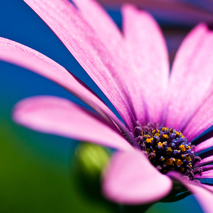
The use of complementary colors is a very prominent aspect of the composition of this photograph: blue and orange, violet and green. The placement of the center of the flower on the lower right 1/3 point adds proportionality to the photo. The very shallow DOF isolates the flower center well. The only issue with the DOF is that the leftmost petal falls right in the middle of the DOF plane making it seem slightly out of focus, even though this is due to DOF. With the angle and lens it is understandable how difficult of a shot this was. I also do like the tricolor background: green to blue to violet as this gives a sense of movement and progression. This photo is very calming, and attribute obtained from the colors used.
Technical
Focus is sharp, which is one reason why this scored so high. Sharpness in floral macro shots is the most important technical objective. I noticed that you shot this on a bright sunny day. That was probably the most important aspect for lighting as flowers tend to look more vibrant in sunlight than artificial. With that said, I'm wondering if a little off camera fill light would have been helpful for the center of the flower. Finally, the DOF suggestions above would have been minimized by using a different angle, slightly higher and aimed down; I don't think the composition strength would have been diminished.
Again, very nice shot, certainly one worthy of its score and position. |
|
 Photographer found comment helpful. Photographer found comment helpful. |
Comments Made During the Challenge  |
|
|
07/18/2009 11:18:50 AM |
| Superb use of complimentary colours. |
|
| Photographer found comment helpful. |
|
|
07/16/2009 02:56:21 PM |
|
| Photographer found comment helpful. |
|
|
07/16/2009 12:48:43 AM |
| Lovely colours and detail. I like the POV very much. |
|
| Photographer found comment helpful. |
|
|
07/15/2009 05:26:25 PM |
| The colours don't look natural to me... I also don't like those two sharp lines of the petals that are in focus. It seems out of place. |
|
|
|
07/14/2009 08:02:27 PM |
|
|
|
07/13/2009 03:38:53 PM |
| Very lovely colors indeed, great stuff. I would have focused on the closest stamina though, maybe used a bit a higher DOF to accentuate the round shape of the flower. |
|
| Photographer found comment helpful. |
|
|
07/13/2009 02:57:28 PM |
| Love the DOF and big photo. Great colours. |
|
| Photographer found comment helpful. |
|
|
07/13/2009 06:18:47 AM |
like the shallow Dof. colors are in harmonie. like also the angle which transformes a powerful feeling.
all in all a fantastic image. good luck! |
|
| Photographer found comment helpful. |
|
|
07/13/2009 12:26:01 AM |
| nice color and composition. |
|
| Photographer found comment helpful. |
Home -
Challenges -
Community -
League -
Photos -
Cameras -
Lenses -
Learn -
Help -
Terms of Use -
Privacy -
Top ^
DPChallenge, and website content and design, Copyright © 2001-2025 Challenging Technologies, LLC.
All digital photo copyrights belong to the photographers and may not be used without permission.
Current Server Time: 03/12/2025 06:53:57 PM EDT.