| Author | Thread |
|
|
06/12/2004 12:49:25 AM |
Hi Anna and * Greetings from the Critique Club *
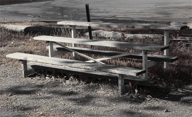
First let's examine the comments that basically say "it doesn't meet the challenge." I personally would have to say that a very high percentahe of bleachers are indeed used for team sports. So - to me, the answer is "of course it meets the challenge." But - DPC voters are oftn very demanding and some require a more obvious tie to the subject. If you are trying for higher scores, it is probably best to leave no doubts. The image should SHOUT "team sport" - not just whisper it.
Photographically, the image is a bit moody and lonely. Perhaps a better title would have been something that suggests the mood, such as "We were division champs 10 years ago." You get the idea.
You have increased the lonely feeling by the very muted colors and the (what appears to be) inclusion of the empty parking lot.
Things that bother me some about the image are:
a) The black triangle in the upper left corner - easily cropped out.
b) the "splotchy" shadows (or whatever the dark spots on the ground are.)
Too bad you didn't find the shot until late in the challenge - if you had more time to play around with this - I bet you could make a stronger entry.
Keep shooting and sharing.
-Tom-
|
|
 Photographer found comment helpful. Photographer found comment helpful. |
Comments Made During the Challenge  |
|
|
06/07/2004 06:00:57 PM |
| Although I like the photo, I don't get how this conveys team sports. |
|
|
|
06/07/2004 05:09:40 PM |
|
|
|
06/06/2004 09:24:40 PM |
| What sport is this supposed to be? 3 |
|
|
|
06/04/2004 10:26:55 PM |
| i love it so simple yet the team was there being watched, good photo |
|
| Photographer found comment helpful. |
|
|
06/03/2004 04:42:24 PM |
| This is a good composition, but the colours are so muted and not very saturated that it appears kind of dull. I realize you're probably trying to create a mood with this one - with teh dead grass, etc., but it's not as compelling because of that. |
|
|
|
06/03/2004 05:11:29 AM |
| Like the tones but the background is rather distracting |
|
| Photographer found comment helpful. |
|
|
06/02/2004 08:16:01 PM |
|
| Photographer found comment helpful. |
|
|
06/02/2004 07:34:40 PM |
| Too bad you can't edit that black spike out. Perhaps a tighter crop of the ends of the bench would have more impact (or not quite on center placement). Seems a little "dull". |
|
| Photographer found comment helpful. |
|
|
06/02/2004 07:05:15 PM |
| Maybe if it had a better location and a cleaner location, no offince but it would be better that way. 8 |
|
| Photographer found comment helpful. |
|
|
06/02/2004 06:12:39 PM |
| nice use of black and white |
|
| Photographer found comment helpful. |
|
|
06/02/2004 05:59:10 AM |
| I like the photo, I think you might get nailed though on people saying "wheres the sport?? I'm confused??" but hey, its a great shot. Good job... |
|
| Photographer found comment helpful. |
|
|
06/02/2004 01:24:45 AM |
| Awesome. Gives a feeling of being robbed of anticipation, of arriving to the field and there is no game ... the desaturation reinforces this feeling ... |
|
| Photographer found comment helpful. |
Home -
Challenges -
Community -
League -
Photos -
Cameras -
Lenses -
Learn -
Help -
Terms of Use -
Privacy -
Top ^
DPChallenge, and website content and design, Copyright © 2001-2025 Challenging Technologies, LLC.
All digital photo copyrights belong to the photographers and may not be used without permission.
Current Server Time: 03/12/2025 02:36:34 AM EDT.