| Author | Thread |
|
|
08/14/2009 09:24:44 AM |
Greetings from the Critique Club
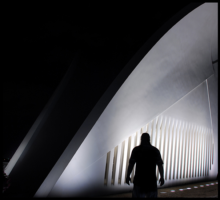
Interesting image, I could imagine seeing it as a book jacket for a murder mystery book.
I like how even though it's a colour image, it looks like a black and white. The composition is good, I am a fan of negative space, although I perhaps would have liked the lone figure to be a bit further to the right, but that's a miniscule nit pick and simply my personal preference. I like the silhouetted figure with the strong backlighting, it's very effective. Also the complete darkness adds to the sense of mystery.
Tying to analyse why this did not score higher is difficult, I think it's a well composed interesting image, but I suppose it perhaps lacks the WOW factor that is typically associated with DPC free study challenges. I would have expected it to be more like 6.0.
|
|
 Photographer found comment helpful. Photographer found comment helpful. |
Comments Made During the Challenge  |
|
|
08/01/2009 09:19:43 AM |
| I like the negative space here - it allows for a greater impact overall. |
|
| Photographer found comment helpful. |
Home -
Challenges -
Community -
League -
Photos -
Cameras -
Lenses -
Learn -
Help -
Terms of Use -
Privacy -
Top ^
DPChallenge, and website content and design, Copyright © 2001-2025 Challenging Technologies, LLC.
All digital photo copyrights belong to the photographers and may not be used without permission.
Current Server Time: 03/14/2025 06:38:02 PM EDT.