| Author | Thread |
|
|
08/05/2009 04:20:15 PM |
Hello from the CC Club,
How funny, I did the same exact shot!!!
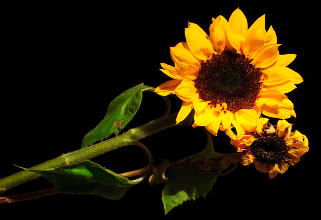
the over all impression i am getting from this, is the placement could have been different. Play around with your props you will be surprised at what comes about. Having the dead sunflower lower would have seperated the two. DPC expects photos to be tack sharp, so in post processing try to sharpen a little at a time until you get the desired affect.
There are no details in the petals which probably hurt your score a little and it seems over saturated.
When you are working with a desk lamp, try different angles, don't be afraid to have it over the top, laying on its side, hanging off your shoulder etc. I think some of the problem may have been that you had your exposure at 2 seconds, this will let in a lot of light and it shows on your petals.
Feel free to pm me if you have any questions
|
|
Comments Made During the Challenge  |
|
|
07/30/2009 08:37:39 AM |
| Not a bad representation of life and death. Light is too bright on the big flower petals and not distributed very well over the other features. |
|
 Photographer found comment helpful. Photographer found comment helpful. |
|
|
07/29/2009 03:59:55 PM |
| The shadows from the lighting throw me off a bit with this shot. |
|
| Photographer found comment helpful. |
|
|
07/29/2009 10:46:27 AM |
| The only reason I'm giving this a low vote is because it could've been taken from a more interesting angle, if the subject matter was going to be so cliche. |
|
| Photographer found comment helpful. |
Home -
Challenges -
Community -
League -
Photos -
Cameras -
Lenses -
Learn -
Help -
Terms of Use -
Privacy -
Top ^
DPChallenge, and website content and design, Copyright © 2001-2025 Challenging Technologies, LLC.
All digital photo copyrights belong to the photographers and may not be used without permission.
Current Server Time: 03/13/2025 05:41:42 AM EDT.