| Author | Thread |
|
|
08/11/2009 05:57:07 PM |
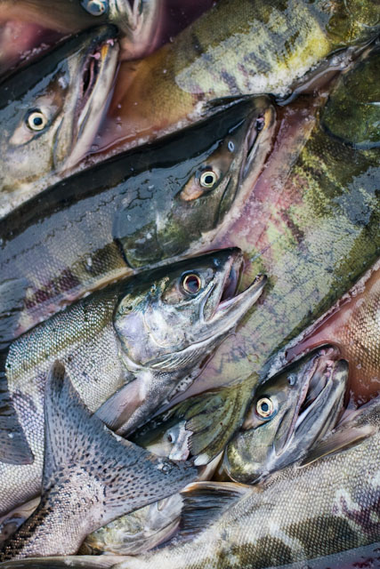
| Wow I am actually really stoked on my placement for a number of reasons. I took this photo while I was out on the boat and didn't know what the challenge was going to be, I just happen to have a photo that worked. I know I should of used a larger depth of field, which I did on my other salmon shots, but this one worked out better compositionally. Another problem I have is editing with my basic macbook, the LCD interupts my color and contrast so badly I never know what it is really going to look like, I need to purchase a external monitor. Editing was really basic, small crop and few minor adjustments to contrast and brightness. I am out at sea again and I left my laptop back in town otherwise I would tell you specifically, but I wont be back until the begining of september sorry. |
|
|
|
08/05/2009 01:13:16 PM |
Greetings from the Critique Club :)
First of all, congratulations! I was looking for another great picture I do remember from this site, in order to compare it with yours. I went through the 25 pages you get after searching for 'fish' and did not find it. But I found that yours was the best from the photos with lots of fish!
So what's a picture of fishes about?
First of all it is about great shapes. The shape of an open mouth is striking and you did well to place it in the center of your composition in order to draw the attention. The tail is another prominent shape and it works well in a corner, but the bottom right part gets a bit lost in the chaotic background.
Secondly, it's about patterns. Again, the diagonal alignment works very well and the one fish lying in the other direction (tail) disturbs the pattern nicely. The pattern would be more effective if it was a bit more regular, but I suppose you could not rearrange them before shooting.
And lastly it's about great shiny colors. Here you missed a bit an opportunity to trigger the WOW-reaction which is so important on this site. I would have played a bit more with curves and saturation or even better tried the LAB technique described here: //ronbigelow.com/videos/videos.htm
From the technical side, your photo is very good. I'm just not sure about the narrow depth of field, it does weaken the pattern and is perceived as a fault when it is not obviously intentional. I would have used f/5.6.
With a subject which is not necessarily the favorite pet of most of the voters, you did really well. I'm sure you have a great future on DPC! If you have any questions about this critique, please contact me. |
|
 Photographer found comment helpful. Photographer found comment helpful. |
|
|
08/05/2009 01:48:09 AM |
| Slippery, slithy and sweet. |
|
| Photographer found comment helpful. |
Comments Made During the Challenge  |
|
|
08/04/2009 11:13:52 PM |
| I never get tired of fish heads. Well captured. |
|
| Photographer found comment helpful. |
|
|
08/04/2009 08:44:56 PM |
awesomely cool photo!! Absolutely love the colors
Just moved it up to a 10 -- this is a magnificent shot. I'd love to see the original to find out how much processing was done. |
|
| Photographer found comment helpful. |
|
|
07/30/2009 12:31:26 PM |
|
|
|
07/29/2009 01:10:09 AM |
| By far the most well constructed image. The lighting makes the most of the moist colourful sheen of the fish. Excellent |
|
| Photographer found comment helpful. |
Home -
Challenges -
Community -
League -
Photos -
Cameras -
Lenses -
Learn -
Help -
Terms of Use -
Privacy -
Top ^
DPChallenge, and website content and design, Copyright © 2001-2025 Challenging Technologies, LLC.
All digital photo copyrights belong to the photographers and may not be used without permission.
Current Server Time: 03/12/2025 01:56:16 PM EDT.