| Author | Thread |
|
|
08/17/2009 06:24:45 PM |
Hi from the C Club!
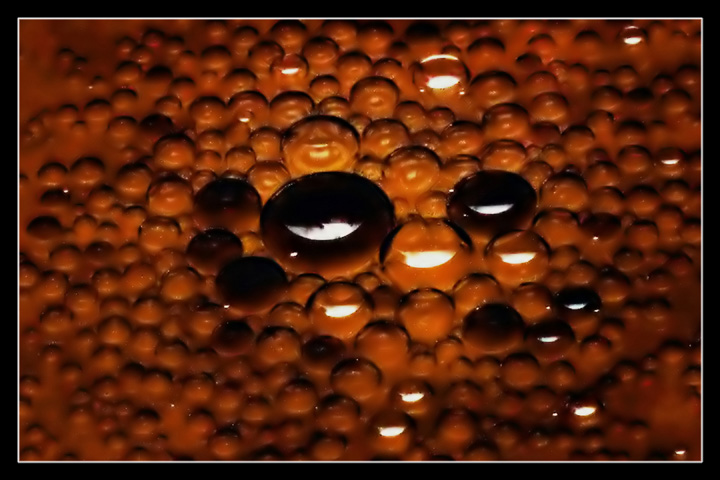
I like that you used the term Soya versus Soy sauce. In the UK and in the USA soy sauce is more commenly known versus the Soya sauce of the Commonwealth.
Your shot is interesting, unless I knew that this challenge was about oil and that you had written soya in your title I would never have guessed what this was. It looks like a macro of something amazing.
That being said, it is a little dark, maybe in post processing you could have used the exposure to lighten it up a little or even brightness contrast. The soya has made a great glob right in the middle of your picture. Maybe have your plate of oil and a drop of soya sauce in a corner then mix it up to give you the rule of thirds.
Your sharpness is spot on and clarity is good. Do remember that you can have up to 200k in Advanced editing and 720 on one side.
|
|
|
|
08/10/2009 12:58:42 AM |
| despite the extremely shallow DOF and "scattered" focus i really love this shot alot. the browns, blacks and white reflections really captivate me. looking through all the pix in the challenge 99% were spot on with my voting... this was the 1% that wasnt. i wouldve loved to have seen it do better. still a 9 in my book |
|
 Photographer found comment helpful. Photographer found comment helpful. |
Comments Made During the Challenge  |
|
|
08/03/2009 06:56:18 PM |
| what's soya sauce? do you just mean soy sauce or is there actually a soya sauce? |
|
| Photographer found comment helpful. |
|
|
08/03/2009 10:35:31 AM |
| Its a little dark. I think it would have been a more effective shot if the focus was darker. Also, I might have tried putting the large blobs of soy sauce in a corner of the frame instead of right in the middle. |
|
| Photographer found comment helpful. |
|
|
08/03/2009 07:27:40 AM |
| Not really sure what I am looking at here and for me personally, that is a minus, I don´t really like abstract images. Plus I would have wanted it more crisp, sharp, seems either slightly out of focus or moved. I do like the lighting though, the glare is not too harsh and the shadow on the top gives the subject nice texture. |
|
| Photographer found comment helpful. |
|
|
08/03/2009 01:25:44 AM |
| Cool pattern. I see some pixellation that may be compression artifacts, or it may just be the appearance of the image that comes across wrong. Either way, at 116k file size, you had a lot more overhead to utilize to get maximum quality out of this. Compression kills detail, always use the least compression you can and still fit the image in under the limit. |
|
| Photographer found comment helpful. |
Home -
Challenges -
Community -
League -
Photos -
Cameras -
Lenses -
Learn -
Help -
Terms of Use -
Privacy -
Top ^
DPChallenge, and website content and design, Copyright © 2001-2025 Challenging Technologies, LLC.
All digital photo copyrights belong to the photographers and may not be used without permission.
Current Server Time: 03/12/2025 03:03:23 PM EDT.