| Author | Thread |
|
|
08/21/2009 03:58:20 PM |
nice looking shot and pose.
Like Anna - I think the muted tones really work well here.
Nice shot |
|
 Photographer found comment helpful. Photographer found comment helpful. |
|
|
08/21/2009 12:13:04 PM |
Greetings from the Critique Club!
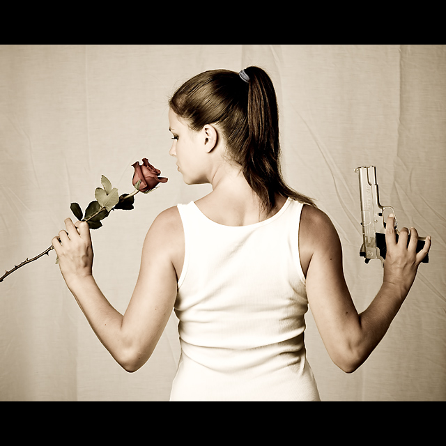
First impression -- love the image, the tones and the light. Agree with the commenters about the sheet, I think it costed you quite a few points, unfortunately.
Techinicals -- I really love the light here. I would have like to see it as a more central composition, with rose and the gun equal distance from the edge. The focus is spot on, while the exposure on the model is good, the background seems a bit underexposed to me and is too similar in tone with the skin of the model.
Final thoughts -- I love the muted colors and the feel of the photo. Great composition and light. Good work.
Feel free to PM me if you have any questions.
Cheers,
Anna |
|
| Photographer found comment helpful. |
Comments Made During the Challenge  |
|
|
08/18/2009 03:49:43 PM |
| great colors & pose & light |
|
| Photographer found comment helpful. |
|
|
08/18/2009 10:47:33 AM |
| love the shot not the backdrop though as i find it both distracting and too similar to the girl's clothes. 7 from me |
|
| Photographer found comment helpful. |
|
|
08/18/2009 06:46:51 AM |
| i would like to see this pic overexposed |
|
| Photographer found comment helpful. |
|
|
08/16/2009 09:52:56 PM |
| an 8 from me... and it's in my top ten. Guns and Roses would be a better known band name perhaps... (voted earlier) |
|
| Photographer found comment helpful. |
|
|
08/15/2009 09:17:45 PM |
| Would have worked for Gun n Roses as well. Good work. The wrinkles in the background are a little distracting. |
|
| Photographer found comment helpful. |
|
|
08/14/2009 12:08:47 AM |
| If the muzzle had been just a touch lower (or the fabric background higher), the wrinkles in the fabric could have looked like smoke... Nice concept and photo. |
|
| Photographer found comment helpful. |
|
|
08/13/2009 09:40:13 PM |
| Interesting shot. I like the lighting. |
|
| Photographer found comment helpful. |
|
|
08/13/2009 11:59:48 AM |
| Great concept. A little too muted in color for me. |
|
| Photographer found comment helpful. |
|
|
08/13/2009 12:35:08 AM |
I really like the light and how you managed the levels. If you did managed them, i think it gave a classy touch to this shot, one of my faves in this challenge. The border fits well too.
The fabric background looks a little crumpled (i don't know if i can use this word for that) and i wish the rose was more colored, saturated.
Nice shot, good luck! :D
PS: I'm not voting this challenge, just commenting!
PS2: Cute model! |
|
| Photographer found comment helpful. |
|
|
08/12/2009 09:06:17 PM |
| Like the tones & the unique profile. |
|
| Photographer found comment helpful. |
|
|
08/12/2009 07:47:33 PM |
| The creases in the backdrop are really distracting. Maybe have her step a few feet off of it and use a larger aperture...? |
|
| Photographer found comment helpful. |
|
|
08/12/2009 12:15:16 AM |
|
| Photographer found comment helpful. |
Home -
Challenges -
Community -
League -
Photos -
Cameras -
Lenses -
Learn -
Help -
Terms of Use -
Privacy -
Top ^
DPChallenge, and website content and design, Copyright © 2001-2025 Challenging Technologies, LLC.
All digital photo copyrights belong to the photographers and may not be used without permission.
Current Server Time: 03/14/2025 03:56:20 PM EDT.