| Author | Thread |
|
|
09/07/2009 01:10:46 PM |
Greetings from the Critique Club...
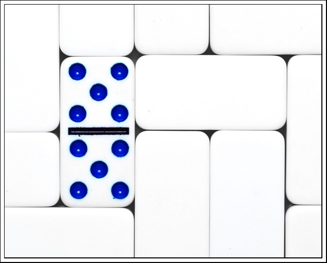
This challenge is one that was rather easy to meet, so that aspect doesn't play a significant role in the results. A score of 5.69 is a little better than the 5.37 average of this challenge.
From my personal perspective, I love images that put shape and texture into the forefront of the composition. Your image does that rather well obviously due to the choice of subject. I also tend to like high contrast images, but this one seems to be just a little over the top in that aspect for me. On the other hand, what this image is lacking for me is some sort of theme that provides a high level of interest for me as the viewer. There is a good story of off balance and symmetry to go along with the shapes and texture, but it's just missing something else and I can't really put my finger on it. Generally when that becomes a problem, its a simple choice of subject that comes into play. |
|
 Photographer found comment helpful. Photographer found comment helpful. |
Comments Made During the Challenge  |
|
|
08/28/2009 01:59:28 PM |
| Very nice! I like the idea and the composition is excellent. Nice job not blowing out the white while making the blues pop! |
|
| Photographer found comment helpful. |
|
|
08/27/2009 10:37:37 PM |
|
| Photographer found comment helpful. |
|
|
08/26/2009 12:55:06 AM |
| cool idea, i would have put the double 3's face up though :P |
|
| Photographer found comment helpful. |
Home -
Challenges -
Community -
League -
Photos -
Cameras -
Lenses -
Learn -
Help -
Terms of Use -
Privacy -
Top ^
DPChallenge, and website content and design, Copyright © 2001-2025 Challenging Technologies, LLC.
All digital photo copyrights belong to the photographers and may not be used without permission.
Current Server Time: 03/12/2025 05:31:21 PM EDT.