| Author | Thread |
Comments Made During the Challenge  |
|
|
08/31/2009 12:54:06 PM |
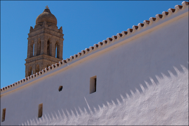
| I like the setcion on the wall, it has some very nice texture and the shadows play well with it. The tower and sky just don't seem to have a lot of impact for me, however. Almost like they are two separate images. |
|
 Photographer found comment helpful. Photographer found comment helpful. |
|
|
08/28/2009 07:05:34 PM |
| Nice composition. It might be my eyes but the tower looks a little crooked twds the right |
|
| Photographer found comment helpful. |
|
|
08/26/2009 08:30:59 PM |
|
| Photographer found comment helpful. |
|
|
08/26/2009 05:22:29 PM |
| My eye went to the closest window, too centered, maybe the foreground should have been blurred? |
|
| Photographer found comment helpful. |
|
|
08/26/2009 09:50:17 AM |
| Nice contrast with the sky, good composition. |
|
| Photographer found comment helpful. |
Home -
Challenges -
Community -
League -
Photos -
Cameras -
Lenses -
Learn -
Help -
Terms of Use -
Privacy -
Top ^
DPChallenge, and website content and design, Copyright © 2001-2025 Challenging Technologies, LLC.
All digital photo copyrights belong to the photographers and may not be used without permission.
Current Server Time: 03/15/2025 10:18:15 AM EDT.