| Author | Thread |
|
|
11/30/2009 04:24:08 PM |
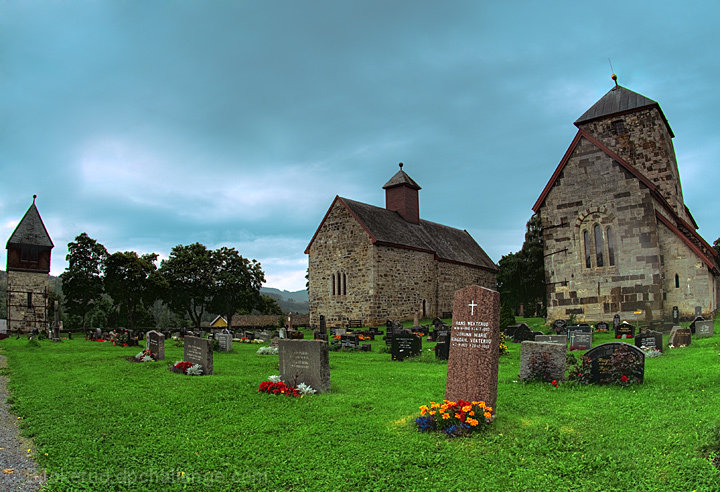
Interesting shot - I'm going to be bold and disagree with Juliet! I really like the colour treatment here and find the green grass to be particularly engaging; I like the blue hue in the sky too.
The only thing that I'd perhaps take issue with is the bit of path on the left of the image - I don't think its inclusion adds anything and it has the potential to detract.
Probably would do much better in something other than a Free Study, but undervalued nonetheless IMHO. |
|
 Photographer found comment helpful. Photographer found comment helpful. |
|
|
09/10/2009 10:01:55 PM |
Hi from the Critique Club,
You asked for your shot to have a comment from a member of the Critique Club.
this is an interesting shot.
I think what hurt you in this shot, is the over saturation of the colours and your leaning towers.
If you had made this black ad white, it may have had a more of an impact of the voters. It would have looked more moody and more drama added to it. As of right now, it kinda looks like a bit flat.
|
|
| Photographer found comment helpful. |
Comments Made During the Challenge  |
|
|
09/01/2009 01:09:01 AM |
| I love the warmth the bits of color from the flowers give this. |
|
| Photographer found comment helpful. |
Home -
Challenges -
Community -
League -
Photos -
Cameras -
Lenses -
Learn -
Help -
Terms of Use -
Privacy -
Top ^
DPChallenge, and website content and design, Copyright © 2001-2025 Challenging Technologies, LLC.
All digital photo copyrights belong to the photographers and may not be used without permission.
Current Server Time: 03/16/2025 05:26:03 AM EDT.