DPChallenge: A Digital Photography Contest You are not logged in. (log in or register
 
Challenge Entries
Portfolio Images
This image is not part of a public portfolio.
My 2nd Choice - Abstract Macro: Fence
777STAN


Photograph Information Photographer's Comments
Challenge: Free Study 2009-08 (Advanced Editing VII)
Camera: Pentax K10D
Lens: Pentax DA 18-55mm f/3.5-5.6 AF
Location: My front yard, Statesboro, GA
Date: Aug 23, 2009
Aperture: F/6.7
ISO: 100
Shutter: 1/500
Galleries: Abstract, Macro
Date Uploaded: Aug 31, 2009

Cropped, Auto-Levels, Auto-Color Correction, Duplicated Layer, Convert to Infrared Black & White, Luminosity Blend, Merged Down, Duplicated Layer, High Pass at 10.0 with Overlay Blending at 50%, Merged Down, Sepia Filter, Resized, Duplicated Layer, Auto-Sharpened with Luminosity Blending, Merged Down, USM, Saved for Web...

Statistics
Place: 408 out of 414
Avg (all users): 3.9063
Avg (commenters): 3.8000
Avg (participants): 3.9109
Avg (non-participants): 3.8889
Views since voting: 636
Views during voting: 224
Votes: 128
Comments: 5
Favorites: 0


Please log in or register to add your comments!

AuthorThread
 Comments Made During the Challenge
09/06/2009 07:26:13 PM
Needs more dramatic lighting -- and maybe a nude.
  Photographer found comment helpful.
09/04/2009 03:54:01 PM
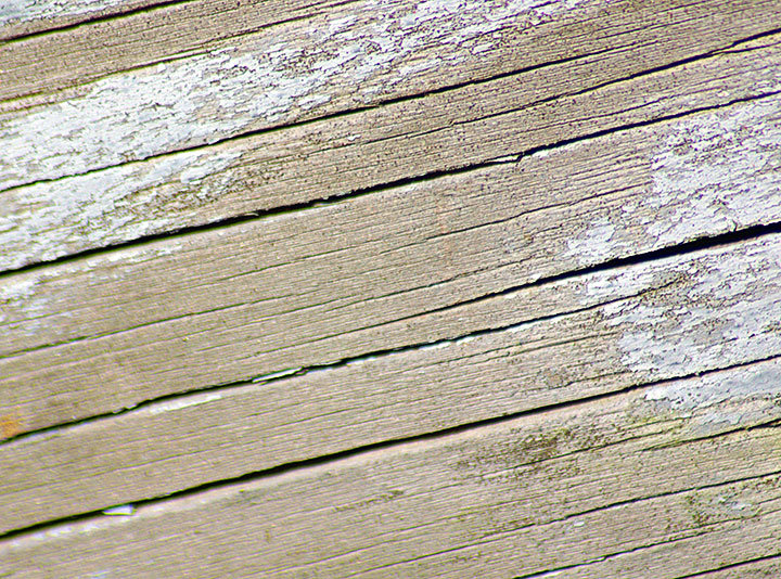
I do like a lot of abstract macro stuff but this isn't really doing it for me really. I think perhaps my problem is maybe that it is not abstract or macro enough. If it was a lot closer, and perhaps with more contrast to bring the texture of the wood out.
  Photographer found comment helpful.
09/01/2009 06:58:03 PM
OK, I'm going through the Free Study submissions, purposefully finding those images I think are shot with a less conventional eye - this is one of those images! Thanks for offering something that isn't just DPC friendly eye-candy (though of course there's nothing wrong with eye-candy):

Positives: If I consider this image within the context of its original purpose (abstract macro), I can see that it is reasonably effective in offering an interesting texture to look at - in fact this might be a great image to use as an overlay.

Critical stuff: Try as I might, I can't talk myself into being a fan of this image. Technically, the focus/ DOF and the apparent chromatic aberration are distracting and artistically I'm just not convinced there's enough going on to engage a viewer.

Overall: I'm afraid I'm not a fan, I'm going to 'fess up and let you know that I'm going to give a well considered but nonetheless harsh 2. Sorry.
  Photographer found comment helpful.
09/01/2009 02:02:38 PM
I know this is nit picking but you lost a bit of focus on the left.
  Photographer found comment helpful.
09/01/2009 11:14:23 AM
The shot needs to have more impact for example more obvious textures is one.
  Photographer found comment helpful.


Home - Challenges - Community - League - Photos - Cameras - Lenses - Learn - Help - Terms of Use - Privacy - Top ^
DPChallenge, and website content and design, Copyright © 2001-2025 Challenging Technologies, LLC.
All digital photo copyrights belong to the photographers and may not be used without permission.
Current Server Time: 03/12/2025 07:46:00 AM EDT.