| Author | Thread |
Comments Made During the Challenge  |
|
|
10/06/2009 06:10:45 PM |
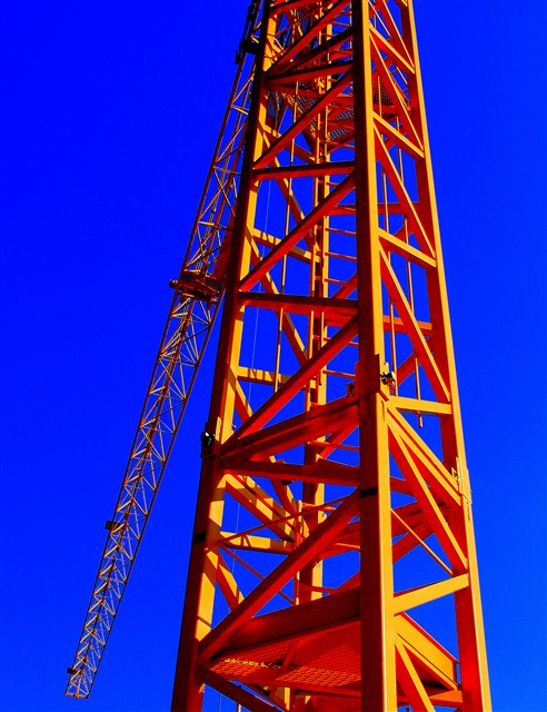
| Maybe it's my monitor, but the colors seem way to saturated here. I think the subject is an interesting one, but I think it might be differently composed to make it more compelling. |
|
 Photographer found comment helpful. Photographer found comment helpful. |
|
|
10/03/2009 11:02:23 PM |
| Way too saturated colours! |
|
| Photographer found comment helpful. |
|
|
10/03/2009 09:00:46 AM |
| A bit over-saturated for my taste. Looks almost fake. |
|
| Photographer found comment helpful. |
|
|
10/02/2009 08:03:07 PM |
| The contrast of red/orange/yellow versus the blue is a little hard on the eyes. |
|
| Photographer found comment helpful. |
|
|
10/01/2009 10:35:25 PM |
| Nice angle, too heavy on the saturation though... |
|
| Photographer found comment helpful. |
|
|
09/30/2009 07:39:42 AM |
| Interesting perspective! The vibrance is VERY vibrant, perhaps a bit much. |
|
| Photographer found comment helpful. |
Home -
Challenges -
Community -
League -
Photos -
Cameras -
Lenses -
Learn -
Help -
Terms of Use -
Privacy -
Top ^
DPChallenge, and website content and design, Copyright © 2001-2025 Challenging Technologies, LLC.
All digital photo copyrights belong to the photographers and may not be used without permission.
Current Server Time: 03/15/2025 12:57:10 PM EDT.