| Author | Thread |
|
|
06/29/2004 03:40:58 PM |
Hi from the Critique Club.
When I critique a shot, I first look at the photo without the title or other information and try to figure out which challenge it was from.
This one was easy to figure out, so you have the connection to the challenge, although I don't think it's a particularly original one.
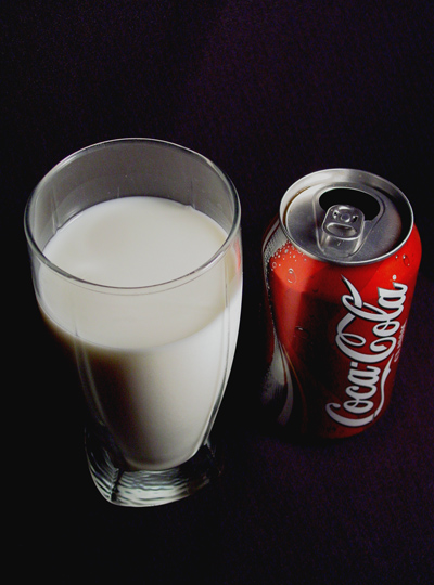
Technically, I think you've done okay here. The colors and lighting seem a bit flat to me, but not too bad by any means. The focus seems good and the image is clear.
For me, what disappoints in the photo is the subject and composition. A can of coke and a glass of milk next to each other just don't hold my interest, even though it does meet the challenge. They are just placed side by side in a mostly centered composition that adds no interest to an already so-so subject matter, in my opinion.
It is very difficult to come up with ways to make a photo carry some sort of "wow" factor - and maybe for some folks this has it, but not for me. I'm not sure how I would improve it. Maybe if the glass and can were on either side of a balance scale or something like that to add interest. I would say to keep trying though and I hope these comments have been helpful.
Judy |
|
Comments Made During the Challenge  |
|
|
06/21/2004 04:50:26 PM |
|
 Photographer found comment helpful. Photographer found comment helpful. |
|
|
06/17/2004 01:03:20 PM |
| Nice shot with nice angle and good concept. Well placed objects next to each other, almost creating a leading line effect. The lighting is okay - perhaps a bit brighter would have added some more "white" to the milk (but that's just my take). |
|
| Photographer found comment helpful. |
|
|
06/16/2004 07:05:46 PM |
| yes this is a good one.... |
|
| Photographer found comment helpful. |
|
|
06/16/2004 06:55:15 PM |
| I like the contrast of light and shade in this photo. A good one for the 'choice' challenge too. |
|
| Photographer found comment helpful. |
|
|
06/16/2004 06:28:34 PM |
| Aw, you makin' me feel bad for having soda. I like the creamy look of the milk, very cool. The background's a little distracting but it's a good pic 8 |
|
| Photographer found comment helpful. |
|
|
06/16/2004 05:29:58 PM |
|
| Photographer found comment helpful. |
|
|
06/16/2004 03:13:05 PM |
| very good, but would be much better if the background was a little darker. the texture and purplish color of the fabric are distracting |
|
| Photographer found comment helpful. |
|
|
06/16/2004 12:15:10 PM |
| People cannot find original idea anymore.... way too much Good-Bad food and pepsi-coke picture.... for me even if the picture is OK, having 10 of the make all of the 1, sorry ! |
|
| Photographer found comment helpful. |
|
|
06/16/2004 11:16:29 AM |
|
| Photographer found comment helpful. |
|
|
06/16/2004 09:23:16 AM |
| Nice. this title also lends the photo to propiganda. I think they are too close together, and the coke can is further back than the glass of milk. |
|
| Photographer found comment helpful. |
|
|
06/16/2004 01:52:56 AM |
| nice idea, but lighting is average. seems like kind of a dull shot to me. 4 |
|
| Photographer found comment helpful. |
Home -
Challenges -
Community -
League -
Photos -
Cameras -
Lenses -
Learn -
Help -
Terms of Use -
Privacy -
Top ^
DPChallenge, and website content and design, Copyright © 2001-2025 Challenging Technologies, LLC.
All digital photo copyrights belong to the photographers and may not be used without permission.
Current Server Time: 04/26/2025 05:34:44 PM EDT.