| Author | Thread |
Comments Made During the Challenge  |
|
|
06/21/2004 10:15:29 PM |
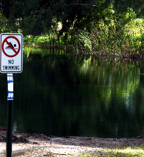
| So what's the choice being illustrated? Water is too dark, and pic is pretty small as well. Seems oversharpened. |
|
|
|
06/21/2004 07:54:46 PM |
|
|
|
06/21/2004 07:23:10 PM |
|
|
|
06/21/2004 04:12:39 AM |
| I'm really struck by the way that the open space and the inviting water contrast with the rigidity and directness of the sign. I wonder if maybe a little more space to the left of the sign may have created a little more balance. Great idea though, well done for spotting the shot. |
|
|
|
06/18/2004 10:45:28 PM |
| I would like this better with a little space between the sign and the edge of the image. |
|
|
|
06/17/2004 06:11:49 PM |
|
|
|
06/17/2004 12:08:52 AM |
|
|
|
06/16/2004 05:54:08 PM |
|
|
|
06/16/2004 04:38:28 PM |
|
Home -
Challenges -
Community -
League -
Photos -
Cameras -
Lenses -
Learn -
Help -
Terms of Use -
Privacy -
Top ^
DPChallenge, and website content and design, Copyright © 2001-2025 Challenging Technologies, LLC.
All digital photo copyrights belong to the photographers and may not be used without permission.
Current Server Time: 03/12/2025 09:34:53 AM EDT.