| Author | Thread |
|
|
06/23/2004 12:58:30 AM |
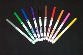
You probably don't want to hear this again, but it can't be overemphasized--This is too small. I liked what I could see of it (although after reading your comment, I'm not sure how great it would look enlarged--a black t-shirt doesn't sound like a promising background--it sounds like a makeshift eBay background I might come up with in a pinch).
I like the composition and that I can see quite well. Unfortunately, at that size, it is impossible to see any detail--like 'is it in focus?' is the background simple or are there distracting creases, etc?"
Someone may have already suggested this but I think there are tutorials for resizing images for the greatest impact. |
|
Comments Made During the Challenge  |
|
|
06/21/2004 10:17:37 PM |
| This would have scored higher if it were larger. It's a good, if somewhat overdone, idea. The black marker is lost in the background, btw. The composition isn't that creative, however. Maybe movei t off center and have less negative space. Just a thought! |
|
|
|
06/18/2004 09:32:13 PM |
| Very small image. Good Idea though. |
|
|
|
06/18/2004 12:31:10 PM |
| too small, and a little simple, but technically well-done. |
|
|
|
06/18/2004 12:04:05 PM |
| try a bigger size next time ... |
|
|
|
06/17/2004 09:00:52 PM |
| There's a little problem with a black marker on a black background. |
|
|
|
06/17/2004 03:20:18 PM |
|
|
|
06/17/2004 01:29:56 PM |
| Great photo and great idea. I only wish it had been bigger to see the crispness of the markers against the background. |
|
|
|
06/17/2004 12:58:54 AM |
|
|
|
06/16/2004 05:23:24 PM |
| Photo is to small, please submit a larger photo in the future. |
|
|
|
06/16/2004 05:07:54 PM |
|
|
|
06/16/2004 11:56:05 AM |
| Cute idea but you need a bigger image to compete |
|
|
|
06/16/2004 11:54:06 AM |
|
|
|
06/16/2004 05:58:55 AM |
|
|
|
06/16/2004 12:23:05 AM |
| The whites seem over exposed in this. |
|
Home -
Challenges -
Community -
League -
Photos -
Cameras -
Lenses -
Learn -
Help -
Terms of Use -
Privacy -
Top ^
DPChallenge, and website content and design, Copyright © 2001-2025 Challenging Technologies, LLC.
All digital photo copyrights belong to the photographers and may not be used without permission.
Current Server Time: 03/12/2025 08:18:01 PM EDT.